A look at Windows 8.1
4th July 2013Last week, Microsoft released a preview of Windows 8.1 and some hailed the return of the Start button but the reality is not as simple as that. Being a Linux user, I am left wondering if ideas have been borrowed from GNOME Shell instead of putting back the Start Menu like it was in Windows 7. What we have got is a smoothing of the interface that is there for those who like to tweak settings and not available be default. GNOME Shell has been controversial too so borrowing from it is not an uncontentious move even if there are people like me who are at home in that kind of interface.
What you get now is more configuration options to go with the new Start button. Right clicking on the latter does get you a menu but this is no Start Menu like we had before. Instead, we get a settings menu with a “Shut down” entry. That’s better than before, which might be saying something about what was done in Windows 8, and it produces a sub-menu with options of shutting down or restarting your PC as well as putting it to sleep. Otherwise, it is place for accessing system configuration items and not your more usual software, not a bad thing but it’s best to be clear about these things. Holding down the Windows key and pressing X will pop up the same menu if you prefer keyboard shortcuts and I have a soft spot for them too.
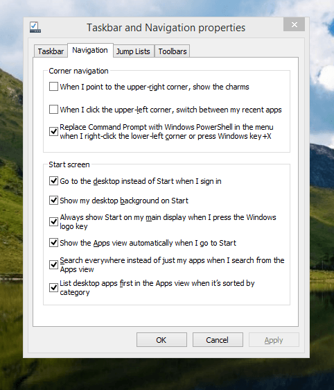
The real power is to be discovered when you right click on the task bar and select the Properties entry from the pop-up menu. Within the dialogue box box that appears, there is the Navigation tab that contains a whole plethora of interesting options. Corner navigation can be scaled back to remove the options of switching between applications at the upper left corner or getting the charms menu from the upper right corner. Things are interesting in the Start Screen section. This where you tell Windows to boot to the desktop instead of the Start Screen and adjust what the Start button gives you. For instance, you can make it use your desktop background and display the Start Screen Apps View. Both of these make the new Start interface less intrusive and make the Apps View feel not unlike the way GNOME Shell overlays your screen when you hit the Activities button or hover over the upper left corner of the desktop.
It all seems rather more like a series of little concessions and not the restoration that some (many?) would prefer. Classic Shell still works for all those seeking an actual Start Menu and even replaces the restored Microsoft Start button too. So, if the new improvements aren’t enough for you, you still can take matters into your own hands until you start to take advantage of what’s new in 8.1.
Apart from the refusal to give us back a Windows 7 style desktop experience, we now have a touchscreen keyboard button added to the taskbar.So far, it always appears there even when I try turning it off. For me, that’s a bug and it’s something that I’d like to see fixed before the final release.
All in all, Windows 8.1 feels more polished than Windows 8 was and will be a free update when the production version is released. My explorations have taken place within a separate VMware virtual machine because updating a Windows 8 installation to the 8.1 preview is forcing a complete re-installation on yourself later on. There are talks about Windows 9 now but I am left wondering if going for point releases like 8.2, 8.3, etc. might be a better strategy for Microsoft. It still looks as if Windows 8 could do with continual polishing before it gets more acceptable to users. 8.1 is a step forward and more like it may be needed yet.
Changing from to Nvidia Graphics Drivers on Linux Mint Debian Edition 64-bit
22nd April 2012One way of doing this is to go to the Nvidia website and download the latest file from the relevant page on there. Then, the next stage is to restart your PC and choose rescue mode instead of the more usual graphical option. This drops you onto a command shell that is requesting your root password. Once this is done, you can move onto the next stage of the exercise. Migrate to the directory where the *.run file is located and issuing a command similar to the following:
bash NVIDIA-Linux-x86_64-295.40.run
The above was the latest file available at the time of writing so the name may have changed by the time that you read this. If the executable asks to modify your X configuration file, I believe that the best course is to let it do that. Editing it yourself or running nvidia-xconfig are alternative approaches if you so prefer.
Proprietary Nvidia drivers are included the repositories for Linux Mint Debian Edition so that may be a better course of action since you will get updates through normal system update channels. Then, the course of action is to start by issuing the following installation comands:
sudo apt-get install module-assistant
sudo apt-get install nvidia-kernel-common
sudo apt-get install nvidia-glx
sudo apt-get install kernel-source-NVIDIA
sudo apt-get install nvidia-xconfig
Once those have completed, issuing the following in turn will complete the job ahead of a reboot:
sudo m-a a-i nvidia
sudo modprobe nvidia
sudo nvidia-xconfig
If you reboot before running the above like I did, you will get a black screen with a flashing cursor instead of a full desktop because X failed to load. Then, the remedy is to reboot the machine and choose the rescue mode option, provide the root password and issue the three commands (at this point, the sudo prefix can be dropped because it’s unneeded) then. Another reboot will see order restored and the new driver in place. Running the following at that point will do a check on things as will be the general appearance of everything:
glxinfo | grep render
Changing to web fonts
12th February 2012While you can add Windows fonts to Linux installations, I have found that their display can be flaky to say the least. Linux Mint and Ubuntu display them as sharp as I’d like but I have struggled to get the same sort of results from Arch Linux while I am not so sure about Fedora or openSUSE either.
That has caused me to look at web fonts for my websites with Google Web Fonts doing what I need with both Open Sans and Arimo doing what I need so far. There have been others with which I have dallied, such as Droid Sans, but these are the ones on which I have settled for now. Both are in use on this website now and I added calls for them to the web page headers using the following code (lines are wrapping due to space constraints):
<link href="http://fonts.googleapis.com/css?family=Open+Sans:300italic,400italic,600italic,700italic,400,300,600,700" rel="stylesheet" type="text/css">
 <link href='http://fonts.googleapis.com/css?family=Arimo:400,400italic,700,700italic' rel='stylesheet' type='text/css'>
With those lines in place, it then is a matter of updating font-family and font declarations in CSS style sheets with “Open Sans” or “Arimo” as needed while keeping alternatives defined in case the Google font service goes down for whatever reason. A look at a development release of the WordPress Twenty Twelve theme caused me to come across Open Sans and I like it for its clean lines and Arimo, which was found by looking through the growing Google Web Fonts catalogue, is not far behind. Looking through that catalogue now causes for me a round of indecision since there is so much choice. For that reason, I think it better to be open to the recommendations of others.
Widely differing approaches
28th January 2012The computer on which I am writing these words is running Linux Mint with the Cinnamon desktop environment, a fork of GNOME Shell. This looks as if it is going to be the default face of GNOME 3 in the next version of Linux Mint with the MGSE dressing up of GNOME Shell looking more and more like an interim measure until something more consistent was available. Some complained that what was delivered in version 12 of the distribution was a sort of greatest hits selection but I reckon that bets were being hedged by the project team.
Impressions of what’s coming
By default, you get a single panel at the bottom of your screen with everything you need in there. However, it is possible to change the layout so that the panel is at the top or there are two panels, one at the top and the other at the bottom. So far, there is no means of configuring which panel applet goes where as was the case in Linux Mint 11 and its predecessors. However, the default placements are very sensible so I have no cause for complaint at this point.
Just because you cannot place applets doesn’t mean that there is no configurability though. Cinnamon is extensible and you can change the way that time is displayed in the clock as well as enabling additional applets. It also is possible to control visual effects such as the way new application windows pop up on a screen.
GNOME 3 is there underneath all of this though there’s no sign of the application dashboard of GNOME Shell. The continually expanding number of slots in the workspace launcher is one sign as is the enabling of a hotspot at the top right hand corner by default. This brings up an overview screen showing what application windows are open in a workspace. The new Mint menu even gets the ability to search through installed applications together with the ability to browser through what what’s available.
In summary, Cinnamon already looks good though a little polish and extra configuration options wouldn’t go amiss. An example of the former is the placement of desktop numbers in the workspace switcher and I already have discussed the latter. It does appear that the Linux Mint approach to desktop environments is taking shape with a far more conventional feel that the likes of Unity or GNOME Shell. Just as Cinnamon has become available in openSUSE, I can see it gracing LMDE too whenever Debian gets to moving over to GNOME 3 as must be inevitable now unless they take another approach such as MATE.
In comparison with revolution
While Linux Mint are choosing convention and streamlining GNOME to their own designs, it seems that Ubuntu’s Unity is getting ever more experimental as the time when Ubuntu simply evolved from one release to the next becomes an increasingly more distant memory. The latest development is the announcement that application menus could get replaced by a heads up display (HUD) instead. That would be yet another change made by what increasingly looks like a top down leadership reminiscent of what exists at Apple. While it is good to have innovation, you have to ask where users fit in all of this but Linux Mint already has gained from what has been done so far and may gain more again. Still, seeing what happens to the Ubuntu sounds like an interesting pastime though I’m not sure that I’d be depending on the default spin of this distro as my sole operating system right now. Also, changing the interface every few months wouldn’t work in a corporate environment at all so you have to wonder where Mark Shuttleworth is driving all this though Microsoft is engaging in a bit of experimentation of its own. We are living in interesting times for the computer desktop and it’s just as well that there are safe havens like Linux Mint too. Watching from afar sounds safer.
Yet another useful Windows shortcut
11th December 2011During the week, I needed to go to a client to upgrade the laptop that they’d given me for doing work for them. The cause was their migration from Windows XP to Windows 7. Office 2010 also came with the now set up and they replace the machines with new ones too. As part of doing this, they carried out upgrade training and this is when I got to learn a thing or two.
While I may have been using Windows 7 since the beta releases first were made available, I am under no illusions that I know all there is to be known about the operating system. Included among the things of which I wasn’t aware was a shortcut key combination for controlling display output from the HP laptop that I’d been given. This is the Windows key + P. This brings up a dialogue screen from which you can select the combination that you need and that includes extending the display across two different screens, such as that of the laptop and an external monitor. Going into the display properties will fine tune things such as what is the main display and the placement of the desktops; there’s no point in having Windows thinking that the external screen is to your left when in fact it is at the right.
Another interesting shortcut is the Windows key + TAB. This affects the Aero application view and repeating the combination cycles through the open applications or you can use a mouse wheel to achieve the same end. With ALT + TAB and the taskbar still about, this might appear more of a curiosity but some may still find it handy so I’ve shared it here too.
All in all, it’s best never to think that you know enough about something because there’s always something new to be learned and it’s always the smallest of things that proves to be the most helpful. With every release of Windows, that always seems to be the case and Windows 8 should not be any different, even if all the talk is about its Metro interface. A beta release is due in the spring of 2012 so we’ll have a chance to find out then. You never can stop learning about this computing business.
A little look at Windows 8
6th November 2011It has been a little while but I have managed to set up a VirtualBox virtual machine in order to take a look at the Developer Preview of the next version of Windows, something that I and others continue to call Windows 8 though Microsoft has yet to confirm the name. When I tried the installation before, it failed on me but that may have been due to having an earlier release of VirtualBox on my machine at that time. 4.1.14 has a preset for Windows 8 and I also happened to notice that it can create virtual hard disks that can be used with competitors like VMWare, Parallels and Virtual PC too. It’s an interesting development but I am left wondering why you’d need to do that when VirtualBox runs on most platforms anyway.
To get back to Windows 8, the installation ran near enough without any intervention apart form stating the language you wanted to use, U.K. English in my case. Starting up the operating system gains you a lock screen that you need to get out of the way so you can log in. It can be dragged out of your way or you can double-click on it or use the carriage return key to get rid of it. Quite why someone thinks it’s a good extra is a little beyond me when a log in screen would suffice. Logging in gets you the new start menu or, as I prefer to think of it, screen. By default, there are a good few Metro apps installed though I decided to rid myself of most of them.
Regarding those apps, one irritation could be that there isn’t that obvious a way to switch away from them to something else. Thankfully, ALT+TAB does seem to work and it has the most instantaneous effect. Otherwise, using the Windows key or hovering over the bottom left corner of the screen to get the menu that brings up the start screen. From the PC user’s point of view, I could see this needing a little more thought because it took a little while for me to figure out what to do. Closing Metro apps isn’t an option either unless you resort to the Task Manager to do so. Microsoft appears to want to leave them open from the point at which you start them until the PC is shut down. It’s a design decision that leaves me unconvinced though, particularly when thoughts of rogue apps running riot on a system come to mind. Then, a stop button could be handy.
There is no start menu as we have come to know it anymore with the start screen replacing it. However, it is possible to limit what’s on there to the software that you use most often an rearrange panels as you’d like them to be. Apart from hosting shortcuts for starting applications, it also acts as a task switcher like the task bar in Windows 7 and there is one of those in Windows 8 too when you jump to the desktop; handily, there’s a panel for that too. Installing Firefox added a panel to the start screen so a little thought has gone into such a common situation and that’s just as well. Still, there’s more work to be done because, currently, there’s no way of changing the background colour of the start screen without resorting to a hex editor or third party tools. Still, you can pick your own picture for the lock screen so things are not all locked down on you.
A preview of IE 10 is included and, apart from the occasional artifact when displaying one of my websites, it seems to work well enough as does Windows Explorer. However, apart from these and a smattering of Metro apps, the Developer Preview does feel barer that previous versions of Windows. However, it does appear that applications like Notepad, PowerShell and the Command Prompt are on there but you need to search for these. That also means that you know about them too so I’d suggest a better way of browsing the applications that are available too. This is one of the weaknesses of Ubuntu’s Unity interface and you need to search in the Dash to find them. Just starting to type in the Metro start screen (and other screens too, it seems) in Windows does trigger the completion of a search box much like what happens in the GNOME Shell Activities screen on systems with GNOME 3. While it’s good to see good ideas being reused from elsewhere, Microsoft might do well to note that you still can browse lists of applications in GNOME 3 too.
Shutting down Windows 8 also seems to be more convoluted than is the case with Windows 7. Logging off and then powering off from the log in screen is one approach and that was my early impression from GNOME 3 too. With the latter, I later was to discover a status menu plugin that added in the option where it was accessible or that using ALT key when clicking the status menu when the plugin wouldn’t work would do what I needed. Without logging off from Windows 8, you can do a shut down using the sidebar that appears on selecting Settings from the menu that pops up on hovering near the bottom left corner of the start screen or the Start button of the task bar of the desktop. Then, look for the power icon and select what you need from the menu that clicking on this icon produces. Of course, you may find that the ALT+F4 key combination when issued while on a clean desktop is the cleanest of all.
All in all, the Developer Preview of the next release of Windows looks fairly usable. That is not to say that there aren’t things that need changing. Apart from this being an early sight of what may be coming to us Windows users, it isn’t unknown for Microsoft to roll back on a radical move to make it more palatable to the user community. After all, it has to watch how it treats the corporate market too. The strong possibility of there being alterations is one thought that needs to be shared with those who are inclined to be losing their tempers at the moment and I have comments with unpleasant language out there on the web (none of that here, please, by the way). As for me, I like to look ahead in order to be forewarned about what’s coming my way in the world of computing. What I have seen so far of the next Windows release is reassuring though there are roughnesses such as PC shutdown and Metro app switching but Microsoft cannot commit commercial suicide either so these have to be fixed. It seems that the world of Microsoft operating systems is in flux with the company’s keeping a firm eye on the world of mobile computing with tablets being a major concern. Others may disagree but I can see Windows 8 working well on conventional PC’s and that’s no bad thing.
A bigger screen?
23rd February 2010A recent bit of thinking has caused me to cast my mind back over all the screens that have sat in front of me while working with computers over the years. Well, things have come a long way from the spare television that I used with a Commodore 64 that I occasionally got to exploring the thing. Needless to say, a variety of dedicated CRT screens ensued as I started to make use of Apple and IBM compatible PC’s provided in computing labs and other such places before I bought an example of the latter as my first ever PC of my own. That sported a 15″ display that stood out a little in times when 14″ ones were mainstream but a 17″ Iiyama followed it when its operational quality deteriorated. That Iiyama came south with me from Edinburgh as I moved to where the work was and offered sterling service before it too started to succumb to aging.
During the time that the Iiyama CRT screen was my mainstay at home, there were changes afoot in the world of computer displays. A weighty 21″ Philips screen was what greeted me on a first day at work but 21″ Eizo LCD displays were set to replace those behemoths and remain in use as if to prove the longevity of LCD panels and the validity of using what had been sufficient for laptops for a decade or so. In fact, the same comment regarding reliability applies to the screen that now is what I use at home, a 17″ Iiyama LCD panel (yes, I stuck with the same brand when I changed technologies longer ago than I like to remember).
However, that hasn’t stopped me wondering about my display needs and it’s screen size that is making me think rather than the reliability of the current panel. That is a reflection on how my home computing needs have changed over time and they show how my non-computing interests have evolved too. Photography is but one of these and the move the digital capture has brought with a greater deal of image processing, so much that I wonder if I need to make less photos rather than bringing home so many that it can be hard to pick out the ones that are deserving of a wider viewing. That is but one area where a bigger screen would help but there is another and it arises from my interest in exploring countryside on foot or on my bike: digital mapping. When planning outings, it would be nice to have a wider field of view to be able to see more at a larger scale.
None of the above is a showstopper that would be the case if the screen itself was unreliable so I am going to take my time on this one. The prospect of sharing desktops across two screens is another idea but that needs some thought about where it all would fit; the room that I have set aside for working at my computer isn’t the largest but it’ll need to do. After the space side of things, then there’s the matter of setting up the hardware. Quite how a dual display is going to work with a KVM setup is something to explore as is the adding of extra video cards to existing machines. After the hardware fiddling, the software side of things is not a concern that I have because of when I used laptop as my main machine for a while last year. That confirmed that Windows (Vista but it has been possible since 2000 anyway…) and Ubuntu (other modern Linux distributions should work too…) can cope with desktop sharing out of the box.
Apart from the nice thoughts of having more desktop space, the other tempting side to all of this is what you can get for not much outlay. It isn’t impossible to get a 22″ display for less than £200 and the prices for 24″ ones are tempting too. That’s a far cry from paying next to £300 (if my memory serves me correctly) for that 17″ Iiyama and I’d hope that the quality is as good as ever.
It’s all very well talking about pricing but you need to sit down and choose a make and model when you get to deciding on a purchase. There is plenty of choice so that would take a while but magazine reviews will come in handy here. Saying that, last year’s computing misadventures have me questioning the sense of going for what a magazine places on its A-list. They also have me minded to go to a nearby computer shop to make a purchase rather than choosing a supplier on the web; it is easier to take back a faulty unit if you don’t have far to go. Speaking of faulty units, last year has left me contemplating waiting until the year is older before making any acquisitions of computer kit. All of that has put the idea of buying a new screen on the low priority list, nice to have but not essential. For now, that is where it stays but you never know what the attractions of a shiny new thing can do…
Easier to print?
20th February 2010One matter that really came to light was how well or not the pages on here and on my hill walking and photography website came out on the printed page. After spotting a WordPress Codex article and with an eye on making things better, I have made a distinction between screen and print stylesheets. The code in the XHTML looks like this:
<link rel=”stylesheet” href=”/style.css” type=”text/css” media=”screen” />
<link rel=”stylesheet” href=”/style_print.css” type=”text/css” media=”print” />
The media attribute seems to be respected by the browsers that I have been using for testing (latest versions of Firefox, MSIE and Opera) so it then was a matter of using CSS to control what was shown and how it was displayed. Extraneous items like sidebars were excluded from the printed page in favour of the real content that visitors would be wanting anyway and everything else was made as monochrome as possible with images being the only things to escape. After all, people don’t want to be wasting paper and ink in this cash strained times and there’s no need to have any more colour than necessary either. Then, there’s the distraction caused by non-functioning hyperlinks that has inspired the sharing of some wisdom on A List Apart. Returning to my implementation, please let me know in the comments what you think of what I have done on here and if there remains any room for improvement.
Some oddness with table cell display in Opera resolved
14th July 2009
Blog sidebar displayed in Opera before fix was applied
A while back, I reported a baffling problem with Opera managing to miss out an entry in the calendar widget on my hillwalking blog. After a bit of fiddling, I managed to track down the problem: setting position:relative in the CSS for hyperlink tags on my theme. Commenting out CSS declarations may seem a low technology way of finding problems like this but it still retains its place as this little episode proves. Changing it to position:static for the hyperlinked numbers in the table fixed the issue while I left the defaults as they were in case they had an adverse impact elsewhere. If all of this sounds rather too empirical in its approach, then I can only agree with you but a fix is a fix nonetheless. However, display:block is also set for the table entries so that may have a part to play too. Regardless of the trial and error feel to the solution, I could not find the problem documented anywhere so I am sharing it here to help any others who encounter the same sort of weirdness.
Running Windows 7 within VirtualBox
12th January 2009With all the fanfare that surrounded the public beta release of Windows 7, I suppose that the opportunity to give it a whirl was too good to miss. Admittedly, Microsoft bodged the roll-out by underestimating the level of interest and corralling everyone into a 24 hour time slot with one exacerbating the other. In the event, they did eventually get their act together and even removed the 2.5 million licence limit. I suppose that they really need to get 7 right after the unloved offering that was Vista so they probably worked out that the more testers that they get, the better. After, it might be observed that the cynical view that the era making people pay to “test” your products might be behind us and that users just want things to work well if not entirely faultlessly these days.
After several abortive raids, I eventually managed to snag myself a licence and started downloading the behemoth using the supplied download manager. I foresaw it taking a long time and so stuck with the 32-bit variant so as not to leave open the possibility of that part of the process using up any more of my time. As it happened, the download did take quite a few hours to complete but this part of the process was without any incident or fuss.
Once the DVD image was downloaded, it was onto the familiar process of building myself a VirtualBox VM as a sandbox to explore the forthcoming incarnation of Windows. After setting up the ISO file as a virtual DVD, installation itself was an uneventful process but subsequent activities weren’t without their blemishes. The biggest hurdle to be overcome was to get the virtual network adapter set up and recognised by Windows 7. The trick is to update the driver using the VirtualBox virtual CD as the source because Windows 7 will not recognise it using its own driver repository. Installing the other VirtualBox tools is a matter of going to Compatibility page in the Properties for the relevant executable, the one with x86 in the file name in my case, and setting XP as the Windows version (Vista works just as well apparently but I played safe and depended on my own experience). While I was at it, I allowed the file to run under the administrator account too. Right-clicking on executable files will bring you to the compatibility troubleshooter that achieves much the same ends but by a different route. With the Tools installed, all was workable rather than completely satisfactory. Shared folders have not worked for but that might need a new version of the VirtualBox software or getting to know any changes to networking that come with Windows 7. I plan to stick with using USB drives for file transfer for the moment. Stretching the screen to fit the VirtualBox window was another thing that would not happen but that’s a much more minor irritation.
With those matters out of the way, I added security software from the list offered by Windows with AVG, Norton and Kaspersky being the options on offer. I initially chose the last of these but changed my mind after seeing the screen becoming so corrupted as to make it unusable. That set me to rebuilding the VM and choosing Norton 360 after the second Windows installation had finished. That is working much better and I plan to continue my tinkering beyond this. I have noticed the inclusion of PowerShell and an IDE for the same so that could be something that beckons. All in all, there is a certain solidity about Windows 7 but I am not so convinced of the claim of speedy startups at this stage. Time will tell and, being a beta release, it’s bound to be full of debugging code that will not make it into the final version that is unleashed on the wider public.