Adding Microsoft core fonts to Debian
18th June 2009When setting up Ubuntu, I usually add in Microsoft’s core fonts by installing the msttcorefonts package using either Synaptic or apt-get. I am not sure why I didn’t try doing the same thing for Debian until now but it’s equally as feasible. Just pop over to System > Administration > Software Sources and ensure that the check-boxes for the contrib and non-free categories are checked like you see below.

You could also achieve the same end by editing /etc/apt/sources.list and adding the non-free and contrib keywords to make lines look like these before issuing the command apt-get update as root:
deb http://ftp.debian.org/debian/ lenny main non-free contrib
deb-src http://ftp.debian.org/debian/ lenny main non-free contrib
All that you are doing with the manual editing route is performing the same operations that the more friendly front end would do for you anyway. After that, it’s a case of going with the installation method of your choice and restarting Firefox or Iceweasel to see the results.
Better font display in Firefox 3 on Ubuntu
12th June 2008Now that all bar one of the Firefox plugins that I use have been updated to work with it, I have finally jumped ship to 3 from 2.0.x. The move wasn’t without its travails, though. For one thing, Google Toolbar stopped working and I resorted to Googlebar Lite instead for my needs. Apart from that, the only other irritation has been the appearance of fonts in the new version.
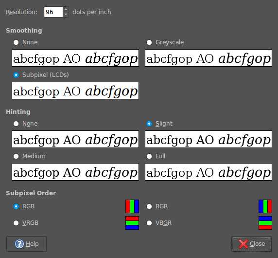
In Firefox 2, it would seem that I was geting away without tweaking my system settings to be their most optimum. With 3, I could do that no longer because of an irritating and pervasive fuzziness that particularly afflicted k’s and w’s. The way out of this turned out to involve changing my Appearance Preferences (Preferences > Appearance from the System menu). The required attention was focussed on the Fonts tab whereupon the Details button was brought into use.
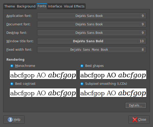
In the resulting dialogue box, smoothing was set to "Subpixel (LCDs)" and hinting to "Slight". Closing down everything after making the required selections and a restart of Firefox was all that was needed to improve matters and more completely make myself at home with Firefox 3.
Trying out Firefox 3 Beta 3 on Ubuntu
20th February 2008Keeping an eye on future browser releases helps to avoid any shocks when maintaining publicly available websites. Therefore, it should come as no surprise that I have been giving Firefox 3 a whirl. As it happens, I have had it going on both Windows and Ubuntu. With the former, I have not encountered any obvious problems but am wondering if the new bookmarking system will mean anything to me. For installation on Ubuntu, I used the following command (I think that I culled it from Tombuntu but can’t remember off hand…):
wget -P ~ ftp://ftp.mozilla.org/pub/firefox/releases/3.0b3/linux-i686/en-US/firefox-3.0b3.tar.bz2 && tar xjf ~/firefox-3.0b3.tar.bz2 -C ~
The nice thing about the above is that it places the test installation in your home directory and away from Firefox 2. It also works regardless of what Linux distribution you have. The profiles get shared between versions so a backup would be a good idea before you start to tinker. As with the Windows version, page loading and rendering is faster in the new version but I found a problem with printing that I hope will get sorted before the final release. Another area for attention is font rendering: it could sharper for sans serif fonts on Ubuntu and serif fonts on Windows. Otherwise, it works well on both platforms and I like the way that open windows are saved on exit, a very good idea carried over from Opera.
A different Firefox II: cross-platform font display issues
18th November 2007One of the things that I have been sorting out on this blog is how the fonts appear in Firefox running on Ubuntu. Even with the same fonts and the same browser, serif fonts were being displayed smaller and appeared more fuzzy in Linux than in Windows. And that’s even with the font sharpening that comes with turning on Ubuntu’s visual effects. So, there was a spot of swapping between Ubuntu and Windows (running on VMware) while I was increasing font sizes to make legibility better on the Linux side without things going all Blue Peter on Windows. Along the way, I added a mention of the Ubuntu font ae_AlArabiya in the CSS to further spruce up things. In my earlier web building efforts, I was having to make serif fonts bigger because of those serifs. From the on-screen legibility point of view, there’s a lot to be said for sans serif fonts and I may yet alter this blog’s theme to use them instead but I’ll ponder the idea a bit more before taking the plunge.
A different Firefox…
17th November 2007On Ubuntu, I made a move to using Ubuntuzilla‘s deployment of Firefox. Because Firefox’s Gecko engine is used by other parts of Ubuntu, any Firefox updates issued by Mozilla don’t come through straight away. The idea of using Ubuntuzilla is that you get Mozilla’s latest, be it Firefox, Thunderbird or Seamonkey, without having an impact on the rest of the Linux installation; Ubuntu’s Firefox is left in place but you are now presented with the vanilla Firefox for all your web surfing needs. Visually, there’s not much change but for the built-in Firefox application fonts coming through in the new instance, a strange sight when you see Ubuntu’s more subtle alternatives everywhere else. I tried the new tack to see if picked up RealPlayer in place of Xine but that sadly has not been the case. Nevertheless, I now have 2.0.0.9 and the latest improvements this side of version 3.
A matter of fonts…
6th November 2007It’s when you pop from one operating system to another that you realise how operating system specific it is that fonts are. For instance, only one of the names in the following list are understood by Firefox on Ubuntu, the last one: Trebuchet MS, Lucida Grande, Verdana, Arial, Sans-Serif. The reason that San-Serif is understood is that it’s a general font class name in the world of CSS. However, that does not mean that you still are not at the mercy of operating system fonts. In fact, font sizes vary and 16px in one font isn’t the same as 16px in another; that can mean broken layouts if you are sufficiently clumsy.
As it happens, the main menu bar on my hillwalking blog should all fit on one line but it took up two lines when viewed on Linux. If it did that neatly, there wouldn’t be much of a problem but it didn’t. Some CSS hacking could have repaired the situation but I went for a simpler solution for now: picking a Linux sans serif font that fitted the bill better. So popping in mentions of "Nimbus Sans L" in appropriate places in my stylesheet was the way that I went. I don’t know how this appears in other Linux distributions but the wonders of virtualisation should allow to find out.
If I was really concerned about the fonts that were being used, I could have gone with a server-side approach: embedded fonts. I haven’t tried this for a while but differing browser support was a major issue when I did: you had to create a set of files for IE and for Netscape when I was investigating such things, hardly convenient even in those days when Opera was merely a speck on the horizon and Mozilla was nascent. It’s a valid approach for those exclusive fonts but so is questioning why you are using them in the first place. Adobe’s Flash is another option for those who obsess with fonts though how users take to this remains an open question, as does the accessibility of the approach.
I will be sticking with testing how things look in different operating systems and virtualisation is an excellent enabler of this, as are Live CD’s. The latter is particularly useful for Linux distributions which the former has application with more scenarios: names OpenSolaris and, with a spot of tinkering, OS X come to mind. It sounds like an intriguing proposition and Firefox is virtually a de facto cross-platform standard these days anyway. Mind you, seeing how websites are rendered by Safari running on OS X might be of interest to some.
Looking at from the user’s point of view rather than the web developer’s, there remains a question regarding the visiting of websites that break because of the font conundrum. If you find this happening to you a lot, it may be an idea to bring in some TrueType or OpenType fonts. With Ubuntu, this is straight forward: fire up Synaptic, search for msttcorefonts and install that package along with any of its dependencies. Logging off from and on to the system will make the new fonts available. There was a time when more work was needed than that…