TOPIC: TASKBAR
Adding a dropdown calendar to the macOS desktop with Itsycal
In Linux Mint, there is a dropdown calendar that can be used for some advance planning. On Windows, there is a pop-up one on the taskbar that is as useful. Neither of these possibilities is there on a default macOS desktop, and I missed the functionality. Thus, a search began.
That ended with my finding Itsycal, which does exactly what I need. Handily, it also integrates with the macOS Calendar app, though I use other places for my appointments. In some ways, that is more than I need. The dropdown pane with the ability to go back and forth through time suffices for me.
While it would be ideal if I could go year by year as well as month by month, which is the case on Linux Mint, I can manage with just the latter. Anything is better than having nothing at all. Sometimes, using more than one operating system broadens a mind.
Using third-party tools to make an Evoluent mouse work as needed on macOS
Now having a new location from which I can work, I acquired an all-in-one desktop computer for use while there. While tempted by an HP option that runs Windows, I ended up choosing an iMac instead. That gained me extra disk space and more memory at a cost. Having UNIX-style command line capability was another attraction. After living with the Windows terminal for a while, its limitations were all too apparent to me.
While I started off desktop computing on a Macintosh Classic and having owned a MacBook Pro in the more recent past, there still was a learning curve. One of these related to the configuration of the mouse supplied with the system. Whatever about only having one button and needing to learn gestures, it was the speed at which the pointer goes that really got me reaching for my more usual Evoluent. Even so, the subsequent discovery of LinearMouse makes things much more bearable once all the requisite permissions were assigned.
Getting the Evoluent configured to my liking needed another third-party application: USB Overdrive. If Evoluent's own software fitted the bill, that would have done. However, they have done some finger pointing at Apple instead of updating it to work with the latest Mac technology. There may be truth in the accusations, but it is striking that another piece of software works when theirs does not. Nevertheless, the other option worked once it got the permissions to detect the hardware. Then, it was a matter of working out which button was which on the mouse, so I could have them assigned as I wished.
After that, I could settle into the new system and get used to its idiosyncrasies. Adding Parallels got me a Windows 11 virtual machine for business compatibility, while I got going with setting up some automation using the macOS terminal. All is becoming more settled than working out of a laptop.
Needing third-party software does have a catch, though: underlying changes to macOS could scupper things. It was the sort of thing that made me move away from GNOME Shell as my Linux desktop. The extensions on which I was depending kept getting obsoleted by every new release. It is something to watch, even if macOS evolves less dramatic than GNOME 3 in its various forms.
Behind the scenes of a website refresh and security overhaul
Things have been changing on here. Much of that has been behind the scenes with a move to a new VPS for extra speed and all the upheaval that brings. It also gained me a better and more responsive system for less money than the old upgrade path was costing me. Extra work has gone into securing the website too, something that has taught me a lot as that has progressed. New lessons were added to older, and sometimes forgotten, ones.
The more obvious change for those who have been here before is that the visual appearance has been refreshed. A new theme has been applied with a multitude of tweaks to make it feel unique and to iron out any rough edges that there may be. This remains a WordPress-based website, and the new theme is a variant of the Appointee child theme of the Appointment theme. Since WordPress does only support child theming but not grandchild theming, I had to make a copy of Appointee of my own so I could modify things as I see fit.
To my eyes, things do look cleaner, crisper and brighter, so I hope that it feels the same to you. Like so many designs these days, the basis is the Bootstrap framework and that is no bad thing in my mind, though the standardisation may be too much for some tastes. What has become challenging is that it is getter harder to find new spins on more traditional layouts, with everything going for a more magazine-like appearance and summaries being shown on the front page instead of complete articles. That probably reflects how things are going for websites these days, which could make the next refresh a more home-grown effort, even if that is a while away yet.
As the website heads towards its sixteenth year, there is bound to be continuing change. In some ways, I prefer that some things remain unchanged, so I use the classic editor instead of Gutenberg because that works best for me. Block-based editing is not for me, since I prefer to tinker with code anyway. Still, not all of its influences can be avoided, leaving me to figure out the new widgets interface. While it did not feel that intuitive, I suppose that I will grow accustomed to it.
My interest in technology continues, even if it saddens me at this time and some things do not impress me; the Windows 11 taskbar is one of those, so I will not be in any hurry to move away from Windows 10. Still, the pandemic has offered its own learning, with virtual conferencing allowing one to lurk and learn new things. For me, this has included R, Python, Julia and DevOps among other things. That proved worthwhile during a time with many restrictions. All that could yield more content yet, and some already is on the way.
As ever, it is my own direct working with technology that yields some real niche ideas that others have not covered. With so many technology blogs out there, they may be getting less and less easy to find, yet everyone has their own journey, so I hope to encounter more of them. There remain times when doing precedes telling, which is how it is on here. It is not all about appearances, since content matters as much as it ever did.
Restoring the menu bar on GNOME Terminal in a GNOME Shell session
By default, a GNOME Terminal instance does not display a menu bar and that applies not only in GNOME Shell but also on the Cinnamon Desktop environment. In the latter, it is easy enough to display the menu bar using the context menu produced by right-clicking in the window before going to Edit > Preferences and ticking the box for Show menubar by default in new terminals in the General section. After closing the Preferences dialogue, every new GNOME Terminal session will show the menu bar.
Unfortunately, it is not so easy in GNOME Shell, though the context menu route does allow you to unhide the menu bar on a temporary basis. That is because the requisite tick box is missing from the Preferences dialogue box displayed after navigating to Edit > Preferences in the menus. To address, you need to execute the following command in a terminal session:
gsettings set org.gnome.Terminal.Legacy.Settings headerbar false
This change permanently adds the menu bar and includes the previously missing tick box, which is selected when necessary. Although GNOME Shell has a minimalist design in some aspects, making this function difficult to access seems excessive.
One way to fix slow CyberGhost VPN connections on Windows 10
Due to a need to access websites with country blocking, I have decided to give CyberGhost a go, and it also will come in handy when connecting devices to other Wi-Fi connections. What I have got is the three-year subscription package and all went well on the first day of use. However, things became unusable on the second and a reboot did not sort it.
Since the problem seemed to affect a phone running Android too, I even got to suspect my router and broadband provider. Even terminating the subscription came to mind, but it did not come to that. Instead, I did a bit more research and tried changing the maximum transition unit (MTU) for the connection to 1300 as suggested in a CyberGhost help article. Because using the Control Panel meant that it was resetting to 1500 on my Windows 10 machine, I then turned to a command line-based solution.
To accomplish that, I started PowerShell in administrator mode from the context menu produced by right-clicking on the Start Menu icon on the taskbar. Then, I entered the following command to see what connections I had and what the MTU settings were:
netsh interface ipv4 show subinterfaces
From looking through the Settings and Control Panel applications, I already had worked out what network interface belonged to the CyberGhost connection. Seeing that the MTU setting was 1500, I then issued a command like the following to change that to 1300.
netsh interface ipv4 set subinterface "<name of ethernet interface>" mtu=1300 store=persistent
Here, <name of ethernet interface> gets replaced by the name of your connection and the string is quoted to avoid spaces in the name causing problems with executing the command. Once that second command had been run, the first one was issued again and the output checked to ensure that the MTU setting was as expected.
While this was done when the VPN connection was inactive, it may work also with an active connection. After making the change, I again reconnected to the VPN and all has been as expected since then, and I found a better connection for my Android phone too.
Lessons learned on managing Windows Taskbar and Start Menu colouring in VirtualBox virtual machines
In the last few weeks, I have had a few occasions when the colouration of the Windows 10 taskbar and its Star Menu has departed from my expectations. At times, this happened in VirtualBox virtual machine installations and both the legacy 5.2.x versions and the current 6.x ones have thrown up issues.
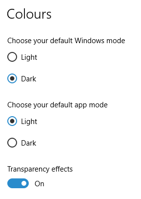
The first one actually happened with a Windows 10 installation in VirtualBox 5.2.x when the taskbar changed colour to light grey and there was no way to get it to pick up the colour of the desktop image to become blue instead. The solution was to change the Windows from Light to Dark in order for the desired colouration to be applied, and the settings above are taken from the screen that appears on going to Settings > Personalisation > Colours.
The second issue appeared in Windows 10 Professional installation in VirtualBox 6.0.x when the taskbar and Start Menu turned transparent after an updated. This virtual machine is used to see what is coming in the slow ring of Windows Insider, so some rough edges could be expected. The solution here was to turn off 3D acceleration in the Display pane of the VM settings after shutting it down. Starting it again showed that all was back as expected.
Both resolutions took a share of time to find and there was a deal of experimentation needed too. Once identified, they addressed the issues as desired. Hence, I am recording them here for use by others as much as future reference for myself.
More thoughts on Windows 10
Now that I have left Windows 8.x behind me and there are a number of my machines running Windows 10, I have decided to revisit my impressions of the operating system. The first Technical Preview was something that I installed in a virtual machine, and I have been keeping an eye on how things have developed since then and intend to retain a Windows Insider installation to see what might be heading our way as Windows 10 evolves as now expected.
After elaborating on the all important upgrade process earlier, I am now moving onto other topics. While the Start Menu is a big item, there are others, as you will see below.
Start Menu
Let's start with an admission: the prototype Start Menu that we got in the initial Windows 10 Technical Preview was more to my liking. Unpinning all the tiles allowed the menu to collapse back to the sort of width that anyone familiar with Windows 7 would have liked. If there was a setting to expunge all tiles at once and produce this state, I would have been well happy.
It was later that we got to learn that Microsoft was not about to consign the Windows 8 Modern interface entirely to history, as many would have wanted. Some elements remain with us, such as a Start Menu with a mandatory area for tiles and the ability to have it display full screen. Some are live, only for this can be turned off on a tile by tile basis and unneeded ones can be removed altogether. It is even possible to uninstall most apps by right-clicking on a tile or other Start Menu entry and selecting the required option from the resulting context menu. For others, there is a command line alternative that uses PowerShell to do removals. After this pruning, things were left in such a state that I have not been moved to restore Classic Shell so far.
While the Start Menu settings used to be in the same place as those for the taskbar, they are found now in the new Settings tool. Some are in the Personalisation section, and it has its own Start subsection for setting full screen mode or highlighting of new apps, among other things. The equivalent Colours subsection is where you find other settings like assigning background colours based on those in a desktop background image, which itself is assigned in it own subsection in the Personalisation area.
Virtual Desktops
Initially, I failed to see the point in how Microsoft implemented these and favoured VirtuaWin instead. My main complaint was the taskbar showed buttons for all open apps regardless of the screen in which they are opened. However, that was changed, so your taskbar shows different buttons for each virtual desktop, just like the way that Linux and UNIX do things. Switching between desktops may not be as smooth as those yet, but the default setting is a move in the right direction, and you can change it if you like.
Cortana
Though this was presented to the world as a voice operated personal assistant like Apple's Siri, I cannot say that I am keen on such things, so I decided to work as I usually do instead. Keyboard interaction works fine, and I have neutered things to leave off web searches on Bing to use the thing much in the same way as the search box on the Windows 7 Start Menu. While it may be able to do more than that, I am more than happy to keep my workflow unchanged for now. Cortana's settings are available via its pop-up menu. Collapsing the search box to an icon to save space for your pinned and open applications is available from the Search section of the taskbar context menu (right-clicking the taskbar produces this).
Settings
In Windows 8.x, the Control Panel was not the only area for settings but remained feature complete. However, the same is not the case for Windows 10 where the new Settings panel is starting to take over from it. Though the two co-exist for now, it seems clear that Settings is where everything is headed.
Though the Personalisation section of the tool has been mentioned in relation to the Start Menu, there are plenty of others. For instance, the Privacy one is one that definitely needs reviewing, and I found myself changing a lot of the default settings in there. Naturally, there are some other sections in Settings that hardly need any attention from most of us and these include Ease of Access (accessibility), Time & language, Devices and Network & Internet. The System section has a few settings like tablet mode that may need review, while the Update & security one has backup and recovery subsections that may be of interest. The latter of these is where you find the tools for refreshing the state of the system following instability or returning to a previous Windows version (7 or 8.x) within thirty days of the upgrade.
Initial impressions of Windows 10
Being ever curious on the technology front, the release of the first build of a Technical Preview of Windows 10 was enough to get me having a look at what was on offer. The furore regarding Windows 8.x added to the interest, so I went to the download page to get a 64-bit installation ISO image.
That got installed into a fresh VirtualBox virtual machine and the process worked smoothly to give something not so far removed from Windows 8.1. However, it took until release 4.3.18 of VirtualBox before the Guest additions had caught up with the Windows prototype, so I signed up for the Windows Insider program and got a 64-bit ISO image to install the Enterprise preview of Windows 10 into a VMware virtual machine since and that supported full screen display of the preview while VirtualBox caught up with it.
Of course, the most obvious development was the return of the Start Menu, and it works exactly as expected too. Initially, the apparent lack of an easy way to disable App panels had me going to Classic Shell for an acceptable Start Menu. It was only later that it dawned on me that unpinning these panels would deliver to me the undistracting result that I wanted.
Another feature that attracted my interest is the new virtual desktop functionality. Here I was expecting something like what I have used on Linux and UNIX. There, each workspace is a distinct desktop, with only the applications open in a given workspace showing on a panel in there. Windows does not work that way with all applications visible on the taskbar regardless of what workspace they occupy, which causes clutter. Another deficiency is not having a desktop indicator on the taskbar instead of the Task View button. On Windows 7 and 8.x, I have been a user of VirtuaWin and this still works largely in the way that I expect of it too, except for any application windows that have some persistence associated with them; the Task Manager is an example and I include some security software in the same category too.
Even so, here are some keyboard shortcuts for anyone who wants to take advantage of the Windows 10 virtual desktop feature:
- Create a new desktop: Windows key + Ctrl + D
- Switch to previous desktop: Windows key + Ctrl + Left arrow
- Switch to next desktop: Windows key + Ctrl + Right arrow
Otherwise, stability is excellent for a preview of a version of Windows that is early on its road to final release. An upgrade to a whole new build went smoothly when initiated following a prompt from the operating system itself. All installed applications were retained, and a new taskbar button for notifications made its appearance alongside the existing Action Centre icon. So far, I am unsure what this does and whether the Action Centre button will be replaced in the fullness of time, yet I am happy to await where things go with this.
All is polished up to now, and there is nothing to suggest that Windows 10 will not be to 8.x what 7 was to Vista. The Start Screen has been dispatched after what has proved to be a misadventure for Microsoft. Regardless of what was hyped a few years ago, the PC still is with us; touchscreen devices like tablets are augmenting it instead of replacing it for any tasks involving some sort of creation. If anything, we have seen the PC evolve with laptops perhaps becoming more like the Surface Pro, at least when it comes to hybrid devices. However, we are not as happy to smudge our PC screens quite like those on phones and tablets, so a return to a more keyboard and mouse centred approach for some devices is welcome.
What I have here are just a few observations; there are more elsewhere, including a useful article by Ed Bott on ZDNet. All in all, we are early in the process for Windows 10 and, though it looks favourable so far, I will continue to keep an eye on how it progresses. The need to be less experimental than Windows 8.x is being fulfilled: so far, it certainly is less schizophrenic and should not be a major jump for users of Windows 7.
A look at Windows 8.1
Last week, Microsoft released a preview of Windows 8.1 and some hailed the return of the Start button, yet the reality is not as simple as that. Being a Linux user, I am left wondering if ideas have been borrowed from GNOME Shell instead of putting back the Start Menu like it was in Windows 7. What we have got is a smoothing of the interface that is there for those who like to tweak settings and not available by default. GNOME Shell has been controversial too, so borrowing from it is not an uncontentious move, even if there are people like me who are at home with that kind of interface.
What you get now is more configuration options to go with the new Start button. While right-clicking on the latter does get you a menu, this is no Start Menu like we had before. Instead, we get a settings menu with a "Shut down" entry. That's better than before, which might be saying something about what was done in Windows 8, and it produces a sub-menu with options of shutting down or restarting your PC as well as putting it to sleep. Otherwise, it is a place for accessing system configuration items and not your more usual software, not a bad thing, but it's best to be clear about these things. Holding down the Windows key and pressing X will pop up the same menu if you prefer keyboard shortcuts, and I have a soft spot for them too.
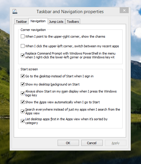
The real power is to be discovered when you right-click on the task bar and select Properties from the pop-up menu. Within the dialogue box that appears, there is the Navigation tab that contains a whole plethora of interesting options. Corner navigation can be scaled back to remove the options of switching between applications in the upper-left corner or getting what is called the Charms menu from the upper-right corner. Things get interesting in the Start Screen section. This where you tell Windows to boot to the desktop instead of the Start Screen and adjust what the Start button gives you. For instance, you can make it use your desktop background and display the Start Screen Apps View. Both of these make the new Start interface less intrusive and make the Apps View feel not unlike the way GNOME Shell overlays your screen when you hit the Activities button or hover over the upper-left corner of the desktop.
It all seems rather more like a series of little concessions, and not the restoration that some (many?) would prefer. Classic Shell still works for all those seeking an actual Start Menu and even replaces the restored Microsoft Start button too. So, if the new improvements aren't enough for you, you still can take matters into your own hands until you start to take advantage of what's new in 8.1.
Apart from the refusal to give us back a Windows 7 style desktop experience, we now have a touchscreen keyboard button added to the taskbar. So far, it always appears there even when I try turning it off. For me, that's a bug, so it's something that I'd like to see fixed before the final release.
All in all, Windows 8.1 feels more polished than Windows 8 was and will be a free update when the production version is released. My explorations have taken place within a separate VMware virtual machine because updating a Windows 8 installation to the 8.1 preview is forcing a complete re-installation on yourself later on. Though there are talks about Windows 9 now, I am left wondering if going for point releases like 8.2, 8.3, etc. might be a better strategy for Microsoft. It still looks as if Windows 8 could do with continual polishing before it gets more acceptable to users. 8.1 is a step forward, and more like it may be needed yet.
Adding a Start Menu to Windows 8
For all the world, it looks like Microsoft has mined a concept from a not often recalled series of Windows: 3.x. Then, we had a Program Manager for starting all our applications, with no sign of a Start Menu. That came with Windows 95 and I cannot see anyone mourning the burying of the Program Manager interface either. It was there in Windows 95 if you knew where to look, and I do remember starting an instance, possibly out of curiosity.
Every Windows user seems to have taken to the Start Menu, regardless of how big it can grow when you install a lot of software on your machine. It didn't matter that Windows NT got it later than Windows 9x ones either; NT 3.51 has the Program Manager too, and it was NT 4 that got the then new interface that has been developed and progressed in no less than four subsequent versions of Windows (2000, XP, Vista & 7). Maybe it was because computing was the preserve of fewer folk that the interchange brought little if any sign of a backlash. The zeitgeist of the age reflected the newness of desktop computing, and its freshness probably brought an extra level of openness too.
Things are different now, though. You only have to hear of the complaints about changes to Linux desktop environments to realise how attached folk become to certain computer interfaces. Ironically, personal computing has just got exciting again after a fairly stale decade of stasis. Mobile computing devices are aplenty nowadays, and it no longer is a matter of using a stationary desktop PC or laptop, even if those brought their own excitement in the 1990's. In fact, reading a title like Computer Shopper reminds me of how things once were with it's still sticking with PC reviews while others are not concentrating on them as much. Of course, the other gadgets get reviewed too, so it is not stuck in any rut. Still, it is good to see the desktop PC getting a look in an age when there is so much competition, especially from phones and tablets.
In this maelstrom, Microsoft has decided to do something dramatic with Windows 8. It has resurrected the Program Manager paradigm in the form of the Start screen and excised the Start Menu from the desktop altogether. For touch screen computing interfaces such as tablets, you can see the sense of this, but it's going to come as a major surprise to many. Removing what lies behind how many people interact with a PC is risky, so you have to wonder how it will work out for all concerned.
What reminded me of this was a piece on CNET by Mary Jo Foley. Interestingly, software is turning up that returns the Start Menu to Windows 8. One of these is Classic Shell, and I decided to give it a go on a Windows 8 Enterprise evaluation instance that I have. Installation is like any Windows program, and I limited the options to the menu and updater. At the end of the operation, a button with a shell icon appeared on the desktop's taskbar. You can make the resultant menu appear like that of Windows XP or Windows 7 if you like. There are other settings like what the Windows key does and what happens when you click on the button with a mouse. By default, both open the new Start Menu, and holding down the Shift key when doing either brings up the Start screen. This is customisable, so you can have things the other way around if you so desire. Another setting is to switch from the Start screen to the desktop after you log into Windows 8 (you may also have it log in for you automatically, but it's something that I do not think anyone should be doing). While the Start screen does flash up, things move along quickly; maybe having not appear at all would be better for many.
Classic Shell is free of charge and worked well for me, apart from that small rough edge noted above. It is also open source and looks well maintained too. For that reason, it appeals to me more than Stardock's Start8 (currently in beta release at the time of writing) or Pokki for Windows 8, which really is an App Store that adds a Start Menu. If you encounter Windows 8 on a new computer, then they might be worth trying should you want a Start Menu back. Being an open-minded type, I could get along with the standard Windows 8 interface, yet it's always good to have choices too. Most of us want to own our computing experience, it seems, so these tools could have their uses for Windows 8 users.