TOPIC: HTML
 1st April 2026
This year, there have been a few entries on here regarding Grav because of my moving parts of my website estate to that content management system, first from Textpattern and latterly from WordPress. Once the second activity was completed, I then added an article on German public holidays elsewhere. That brought me to the topic of this piece: ensuring that some Markdown was rendered as required.
There were two parts to this: the styling of tables and the actions of hyperlinks. Each needs to be performed in a page template when all HTML has been initially rendered. Further processing then makes the required changes. Since this is a page template and not a partial template and not a partial template, you need to import a master template like this:
{% extends 'partials/base.html.twig' %}
Then, you go to the next stage, defining the content block within {% block content %}...{% endblock %} Twig tags:
{% set content = page.content

|replace({'<table>': '<table class="table mt-5 mb-5">'})

|replace({'<a href="http': '<a target="_blank" rel="noopener noreferrer" href="http'})

%}
The above reads in the page content (page.content) and does some text replacement operations. The first of these changes <table> to <table class="table mt-5 mb-5">, while the second replaces <a href="http with <a target="_blank" rel="noopener noreferrer" href="http. While my content was a mix of Markdown and HTML, depending on the article, the latter operation appeared to standardise every link.
Once the text replacement has been completed, the next step is to output the processed HTML like this:
{{ content|raw }}
This last line sits outside the {% block content %}...{% endblock %} block; coming after it, in fact. To send the processed output to the generated web page, you need to ensure that you are referring to the right variable, the local one called content and not page.content. The raw filter also is essential here to ensure that nothing is rendered into HTML when the raw HTML itself is what is needed.
All of this effort ensures that straightforward Markdown can be used in content, while Grav does some extra work in the background to ensure that all is rendered without extra intervention. While there may need to be a certain level of standardisation to make this all work well, I find that it does what is needed, albeit in a different manner from shortcode approach that you find in Hugo.
14th March 2026
Working with SAS output involves two related but distinct concerns: how results look, and how values are displayed. The material here covers both sides of that equation. On one hand, the DEFINE STYLE statement in PROC TEMPLATE provides a way to create and customise ODS styles for destinations that support the STYLE= option. On the other, SAS formats determine how character, numeric, date and time values are written in output. Taken together, these features shape both presentation and readability, which is why it is useful to understand them in the same discussion.
The DEFINE STYLE Statement
The DEFINE STYLE statement is the foundation for creating a stand-alone style. Its syntax allows a style to be stored in a template store and to include inherited behaviour, notes, imported CSS and individual style element definitions. A style definition begins with DEFINE STYLE followed by a style path (or in the special case of Base.Template.Style, it is that name itself), and it must end with an END statement. That final END is not optional, as it is a hard requirement. Within the body of the style, statements such as PARENT=, NOTES, CLASS, IMPORT and STYLE determine how the style behaves and what it contains.
Style Paths and the STORE= Option
The style path identifies where a style is stored. It consists of one or more names separated by periods, with each name representing a directory in a template store. PROC TEMPLATE writes the style to the first writeable template store in the current path unless a STORE= option directs it elsewhere. The STORE=libref.template-store option specifies a particular template store, and if that template store does not already exist, SAS creates it automatically. One important point is that the syntax of the STORE= option does not become part of the compiled template, so it affects where the style is saved rather than the internal definition itself.
Base.Template.Style
A notable special case is Base.Template.Style. This creates a style that becomes the parent of all styles that do not explicitly specify a parent, and once created it is automatically applied to output until it is specifically removed from the item store. That convenience comes with a clear caution: the SAS-supplied Base.Template.Style contains inheritance information relied upon by many styles, and if that inheritance structure is not preserved, some style elements might not appear in output. The safer route is therefore to start from the existing Base.Template.Style, write it to an external file and edit its contents rather than constructing a replacement from scratch. There is also a restriction: if PARENT= is specified, it must refer to a style other than Base.Template.Style.
Inheritance and the PARENT= Statement
Inheritance is central to how ODS styles work. The PARENT= statement specifies the style from which the current style inherits its style elements, style attributes and statements. The style path named in PARENT= is looked up in the first readable template store in the current path, and unless the current style overrides something, everything in the parent style carries through. SAS ships with several styles that can be used as a base, including styles.default, styles.beige, styles.brick, styles.brown, styles.d3d, styles.minimal, styles.printer and styles.statdoc. This inheritance model makes style creation more manageable because most new styles are refinements of existing ones rather than fully independent definitions.
The NOTES Statement
For documentation inside the style itself, the NOTES statement provides a place to store descriptive text. This differs from a SAS comment because the text becomes part of the compiled style template and can be viewed with the SOURCE statement. That makes NOTES useful for recording what a style is for, what it changes, or any implementation detail worth preserving alongside the template. In a shared environment, that sort of embedded documentation can be more durable than comments kept in a separate program file.
The CLASS Statement
The CLASS statement creates a style element from a like-named style element. In practical terms, it duplicates an existing element of the same name and applies modifications. The three statements class fonts;, style fonts from fonts; and style fonts from _self_; are equivalent, making CLASS a convenience form for a common pattern. It takes one or more style element names, optional descriptive text and optional attribute specifications. If the same attribute is specified more than once, the last value given is the one SAS uses, and that rule is worth keeping in mind when reading or maintaining larger templates.
The STYLE Statement
The STYLE statement is more general and is the main mechanism for creating or modifying one or more style elements. It can define new elements, override inherited ones, or absorb attributes from an existing element by using the FROM option. When a new style element overrides one that is a parent of other elements, all of its descendants (including those inherited from parent styles) also inherit the new attributes, which is one of the reasons why small changes can have broad visual effects in output. Style elements within a single STYLE statement must be separated by commas.
The distinction between using FROM and not using it is particularly important. If a like-named style element already exists in the child style, and it is not created with FROM, the child version overrides the parent version entirely. If it is created with FROM, the attributes from the parent style element are absorbed into the child style element. Without FROM, an attribute defined in a like-named style element in the parent is not inherited unless it is explicitly specified again. With FROM, inherited attributes remain in play and can then be modified selectively, and this is the practical difference between replacement and extension.
The _SELF_ keyword is a shorthand within the STYLE statement, specifying that each named style element should inherit from an existing style element of the same name. It is most useful when specifying multiple style elements in one statement. For example, the single statement style data, data1, dataempty from _self_ / color = red backgroundcolor = black; is exactly equivalent to writing separate STYLE statements for data, data1 and dataempty individually. Where the same attribute appears more than once among multiple identical style element names, the last value specified is used. PROC TEMPLATE looks first in the current style for the named style element when resolving a FROM reference, and only looks in the parent style if the element is not found there.
Style Attributes
Style attributes follow the general form style-attribute-name=<|>style-attribute-value. Standard attribute names from the documented list are written without quotation marks, while user-defined attribute names must be enclosed in quotation marks. The vertical bar (|) symbol prevents the style attribute from being inherited by any child style elements, allowing a template author to control precisely how far a change spreads through the inheritance tree. Text associated with a STYLE statement also becomes part of the compiled template (much like NOTES), which can help explain why a specific element is defined in a particular way.
The IMPORT Statement and CSS
The IMPORT statement bridges CSS and ODS styles by importing Cascading Style Sheet information from a file into the style. The file specification can be an external file path, a fileref or a URL, and once imported, SAS converts the CSS code into style attributes and style elements that can be used by PROC TEMPLATE. There are requirements of which you need to be aware: the CSS file must be written in the same type of CSS that the ODS HTML statement produces, and only class names that match ODS style element names are supported, with no IDs and no context-based selectors permitted. If needed, the CSS that ODS creates can be examined with the STYLESHEET= option, or by viewing the HTML source and inspecting the code at the top of the file.
Media types add another layer to the IMPORT statement. The syntax allows up to ten media types to be specified, separated by commas, corresponding to how output will be rendered on screen, paper, with a speech synthesiser or with a braille device, for example. CSS code outside any media block is always included, and the media type option additionally imports the section of a CSS file intended only for a specific media type. If no media type is specified in the ODS statement, but media types exist in the CSS file, ODS uses the Screen media type by default. If multiple media types are specified, all of their style information is applied, though if duplicate style information appears in different media blocks, the styles from the last media block are used.
The REPLACE Statement
One statement that no longer belongs in current practice is REPLACE. The SAS documentation states plainly that it is no longer supported and that STYLE or CLASS should be used instead to create and modify style elements. That is a useful reminder when reading older code, as REPLACE appears in legacy templates and conference papers that predate its deprecation.
The ODS Style Element Catalogue
To make sense of style customisation, it helps to understand the wider catalogue of ODS style elements. These elements are organised by function, and many are abstract, meaning they exist for inheritance purposes rather than direct rendering. Abstract elements are not explicitly used in ODS output and will not appear in destinations that generate a style sheet.
Miscellaneous and Document Elements
A broad abstract element, Container, controls all container-oriented elements and sits near the top of several inheritance chains. Document-related elements such as Document, Body, Frame, Contents and Pages control the overall presentation of output files, including page background and margins, with Body, Frame, Contents and Pages all inheriting from Document. Several further miscellaneous elements handle specific rendering concerns: Continued controls the continued flag when a table breaks across a page (paginated destinations only), ExtendedPage handles the message displayed when a page will not fit (Printer destination only), PageNo controls page numbers for paginated destinations and Parskip controls the space between tables. UserText controls the ODS TEXT= style and inherits from Note. The StartUpFunction and ShutDownFunction elements add JavaScript functions to HTML output that execute on page load and page exit, respectively, and PrePage controls the ODS RTF/MEASURED PREPAGE= style.
Date Elements
Date-related elements include Date (an abstract element controlling how date fields look), BodyDate (which controls the date field in the Contents file and inherits from ContentsDate) and PagesDate (which controls the date field in the Pages file and inherits from Date).
Contents and Pages Elements
Contents and pages files are influenced by a substantial group of elements. IndexItem is an abstract element controlling list items and folders for both files. ContentFolder controls folders in the Contents file, and ByContentFolder controls byline folders there, inheriting from ContentFolder. ContentItem controls items in the Contents file and PagesItem controls items in the Pages file, both inheriting from IndexItem. The abstract element Index covers miscellaneous Contents and Pages components, and from it inherit IndexProcName, ContentProcName, ContentProcLabel, PagesProcName and PagesProcLabel, which handle procedure names and labels in each file. IndexTitle and ContentTitle control the titles of the Contents and Pages files; in styles.default, ContentTitle contains a PRETEXT= attribute that prints the text "Table of Contents". IndexAction and FolderAction determine what happens on mouse-over events for folders and items (HTML only). SysTitleAndFooterContainer controls the container for system page titles and footers, and is generally used to add borders around a title.
Titles, Footers and Related Elements
Titles and footers are handled by the abstract element TitlesAndFooters, which controls system page title and footer text. SystemTitle inherits from it and chains through SystemTitle2 up to SystemTitle10, with each inheriting from the one before. The footer series follows the same pattern from SystemFooter through SystemFooter2 to SystemFooter10. TitleAndNoteContainer controls the container for procedure-defined titles and notes, inheriting from Container. ProcTitle controls procedure title text and inherits from TitlesAndFooters, with ProcTitleFixed handling procedure title text that requests a fixed font.
Bylines
BylineContainer controls the container for the byline (generally used to add borders) and inherits from Container. Byline controls byline text and inherits from TitlesAndFooters.
Notes, Warnings and Errors
Notes, warnings and errors each consist of two pieces: a banner area and a content area. The abstract element Note controls the container for note banners and note contents, and inherits from Container. The banner elements (NoteBanner, WarnBanner, ErrorBanner and FatalBanner) generally use the PRETEXT= attribute to print the banner label. Each has a corresponding content element (NoteContent, WarnContent, ErrorContent and FatalContent), and fixed-font variants exist for note, warning and error content (NoteContentFixed, WarnContentFixed and ErrorContentFixed). All of these elements inherit from Note.
Table Elements
Elements governing table output form a substantial hierarchy. Output is an abstract element that controls basic output forms, including borders (via FRAME=, RULES= and individual border control attributes), cell spacing, cell padding and background colour, inheriting from Container. Table controls overall table style and inherits from Output, as does Batch (which controls batch mode output). Three further abstract elements are specific to RTF output: TableHeaderContainer (which places and controls the box around all column headings), TableFooterContainer (which does the same for column footers) and ColumnGroup (which controls the box around groups of columns).
Data Cell Elements
Cell is an abstract element that controls data, header and footer cells, inheriting from Container. Data cells are controlled by Data (the default style for data cells), DataFixed (for data cells requesting a fixed font), DataEmpty (for empty data cells), DataEmphasis (for emphasised data cells), DataEmphasisFixed (for emphasised data cells requesting a fixed font), DataStrong (for strong, more emphasised data cells) and DataStrongFixed. All inherit from Cell or from one another in a chain.
Header and Footer Cell Elements
Header and footer cells are governed by HeadersAndFooters, an abstract element inheriting from Cell. Headers include Header, HeaderFixed, HeaderEmpty, HeaderEmphasis, HeaderEmphasisFixed, HeaderStrong and HeaderStrongFixed. Row headers follow a parallel set: RowHeader, RowHeaderFixed, RowHeaderEmpty, RowHeaderEmphasis, RowHeaderEmphasisFixed, RowHeaderStrong and RowHeaderStrongFixed. Footers mirror the same pattern through Footer, FooterFixed, FooterEmpty, FooterEmphasis, FooterEmphasisFixed, FooterStrong and FooterStrongFixed, with row footers following suit via RowFooter and its variants. PROC TABULATE captions are separately covered by the abstract element Caption (which inherits from HeadersAndFooters), BeforeCaption and AfterCaption.
SAS Formats
While styles affect appearance, formats affect representation. SAS organises formats into four categories: Character, Date and Time, ISO 8601 and Numeric. Formats that support national languages are documented separately in the SAS National Language Support reference, and storing user-defined formats is an important consideration when those formats are associated with variables in permanent SAS data sets shared with others.
Character Formats
Character formats cover both simple display and conversion tasks. $CHARw. and $w. write standard character data, while $QUOTEw. encloses values in double quotation marks. $UPCASEw. converts character data to uppercase, and $MSGCASEw. writes uppercase output when the MSGCASE system option is in effect. Several formats transform character data into alternative encodings or representations: $ASCIIw. converts to ASCII, $EBCDICw. converts to EBCDIC, $HEXw. converts to hexadecimal, $BINARYw. converts to binary and $OCTALw. converts to octal. Others alter ordering or length handling: $REVERJw. writes character data in reverse order and preserves blanks, $REVERSw. writes it in reverse and left-aligns it, and $VARYINGw. writes character data of varying length. $BASE64Xw. converts character data into ASCII text using Base 64 encoding.
Date and Time Formats
Date and time formats are especially broad. Traditional date formats include DATEw. (writing values as ddmmmyy or ddmmmyyyy), DDMMYYw. and DDMMYYxw. (day-month-year with various separators), MMDDYYw. and MMDDYYxw. (month-day-year), YYMMDDw. and YYMMDDxw. (year-month-day), MONYYw. (month and year), MONNAMEw. (month name), DOWNAMEw. (day of week name), WEEKDATEw. and WEEKDATXw. (day of week and date in different orderings) and WORDDATEw. and WORDDATXw. (month name with day and year in different orderings). Quarter and year formats include QTRw., QTRRw. (Roman numerals), YEARw., YYQw., YYQxw., YYQRw. and YYQRxw.. Week number formats include WEEKUw., WEEKVw. and WEEKWw., each using a different numbering algorithm.
Year-month combination formats include YYMMw., YYMMxw., YYMONw., MMYYw. and MMYYxw.. DAYw. writes the day of the month and WEEKDAYw. writes the day of the week as a number. Time and date time formats include TIMEw.d, TIMEAMPMw.d, TODw.d, HHMMw.d, HOURw.d, MMSSw.d, DATETIMEw.d and DATEAMPMw.d. Formats that take a date time value and write only part of it include DTDATEw., DTMONYYw., DTWKDATXw., DTYEARw. and DTYYQCw.. Julian date formats include JULDAYw. (Julian day of the year), JULIANw. (Julian date in yyddd or yyyyddd), PDJULGw. (packed Julian in hexadecimal yyyydddF for IBM) and PDJULIw. (packed Julian in hexadecimal ccyydddF for IBM).
The $N8601 character formats also appear within the Date and Time category. $N8601Bw.d and $N8601BAw.d both write ISO 8601 duration, date time and interval forms using basic notations. $N8601Ew.d and $N8601EAw.d use extended notations. $N8601EHw.d uses extended notation with a hyphen for omitted components, $N8601EXw.d uses an x in place of each digit of an omitted component, $N8601Hw.d drops omitted components in duration values and uses a hyphen for omitted date time components, and $N8601Xw.d drops omitted duration components and uses an x for each digit of an omitted date time component.
ISO 8601 Formats
The ISO 8601 category covers the same $N8601 character formats listed above, together with the B8601 (basic notation) and E8601 (extended notation) families of numeric formats. Basic formats include B8601DAw. (date as yyyymmdd), B8601DNw. (date from a date time value as yyyymmdd), B8601DTw.d (date time as yyyymmddThhmmssffffff), B8601DZw. (date time in UTC with time zone offset as yyyymmddThhmmss+|-hhmm), B8601LZw. (local time with UTC offset as hhmmss+|-hhmm), B8601TMw.d (time as hhmmssffff) and B8601TZw. (time adjusted to UTC as hhmmss+|-hhmm). Extended formats follow the same structure: E8601DAw. (date as yyyy-mm-dd), E8601DNw., E8601DTw.d, E8601DZw., E8601LZw., E8601TMw.d and E8601TZw.d, each using hyphen and colon delimiters to separate date and time components. These formats are important where standards compliance, machine readability or time zone clarity matter.
Numeric Formats
Numeric formats address general presentation, technical encoding and domain-specific output. BESTw. lets SAS choose the best notation, w.d writes standard numeric data one digit per byte and Zw.d adds leading zeroes. BESTDw.p lines up decimal places for values of similar magnitude and prints integers without decimals. Dw.p does the same over a potentially wider range of values, and Ew. writes values in scientific notation.
Financial and punctuation-sensitive displays are handled by COMMAw.d (comma every three digits, period for decimal), COMMAXw.d (period every three digits, comma for decimal), NUMXw.d (comma in place of the decimal point), DOLLARw.d, DOLLARXw.d, PERCENTw.d, PERCENTNw.d (using a minus sign for negative values) and NEGPARENw.d (negative values in parentheses). Integer and binary formats include IBw.d (native integer binary including negative values), IBRw.d (integer binary in Intel and DEC formats), PIBw.d (positive integer binary), PIBRw.d (positive integer binary in Intel and DEC formats) and RBw.d (real binary floating-point). Floating-point formats include FLOATw.d (native single-precision) and IEEEw.d. FRACTw. converts values to fractions.
Encoding formats include HEXw. (hexadecimal), BINARYw. (binary), OCTALw. (octal), PDw.d (packed decimal), PKw.d (unsigned packed decimal) and ZDw.d (zoned decimal). IBM mainframe formats form their own group: S370FFw.d (standard numeric), S370FIBw.d (integer binary including negative values), S370FIBUw.d (unsigned integer binary), S370FPDw.d (packed decimal), S370FPDUw.d (unsigned packed decimal), S370FPIBw.d (positive integer binary), S370FRBw.d (real binary floating-point), S370FZDw.d (zoned decimal), S370FZDLw.d (zoned decimal leading sign), S370FZDSw.d (zoned decimal separate leading sign), S370FZDTw.d (zoned decimal separate trailing sign) and S370FZDUw.d (unsigned zoned decimal). VAXRBw.d writes real binary data in VMS format and VMSZNw.d generates VMS and OpenText COBOL zoned numeric data.
Readable formats include ROMANw. (Roman numerals), WORDSw. (values as words) and WORDFw. (values as words with fractions shown numerically). The SSNw. format writes Social Security numbers and PVALUEw.d writes p-values.
Combining ODS Styles and Formats for Cleaner SAS Output
The connection between style definitions and formats is straightforward, even if the details are substantial. Styles determine the visual structure of ODS output through inheritance, element definitions and optional CSS imports, while formats determine how the values inside that output are written. A report can therefore be shaped at two levels at once: the appearance of titles, tables, notes and cells through DEFINE STYLE, and the textual form of dates, times, percentages, identifiers and other values through the SAS format system. Understanding both gives a clearer picture of how SAS turns data into output that is both functional and legible.
22nd February 2026
Inspired by building a modular landing page on a Grav-powered subsite, I wondered about doing the same for a Hugo-powered public transport website that I have. It was part of an overall that I was giving it, with AI consultation running shotgun with the whole effort. The home page design was changed from a two-column design much like what was once typical of a blog, to a single column layout with two-column sections.
The now vertical structure consisted of numerous layers. First, there is an introduction with a hero image, which is followed by blocks briefly explaining what the individual sections are about. Below them, two further panels describe motivations and scope expansions. After those, there are two blocks displaying pithy details of recent public transport service developments before two final panels provide links to latest articles and links to other utility pages, respectively.
This was a conscious mix of different content types, with some nesting in the structure. Much of the content was described in page front matter, instead of where it usually goes. Without that flexibility, such a layout would not have been possible. All in all, this illustrates just how powerful Hugo is when it comes to constructing website layouts. The limits essentially are those of user experience and your imagination, and necessarily in that order.
On Hugo Home Pages
Building a home page in Hugo starts with understanding what content/_index.md actually represents. Unlike a regular article file, _index.md denotes a list page, which at the root of the content directory becomes the site's home page. This special role means Hugo treats it differently from a standard single page because the home is always a list page even when the design feels like a one-off.
Front matter in content/_index.md can steer how the page is rendered, though it remains entirely optional. If no front matter is present at all, Hugo still creates the home page at .Site.Home, draws the title from the site configuration, leaves the description empty unless it has been set globally, and renders any Markdown below the front matter via .Content. That minimal behaviour suits sites where the home layout is driven entirely by templates, and it is a common starting point for new projects.
How the Underlying Markdown File Looks
While this piece opens with a description of what was required and built, it is better to look at the real _index.md file. Illustrating the block-driven pattern in practical use, here is a portion of the file:
---
title: "Maximising the Possibilities of Public Transport"
layout: "home"
blocks:
  - type: callout
    text1: "Here, you will find practical, thoughtful insight..."
    text2: "You can explore detailed route listings..."
    image: "images/sam-Up56AzRX3uM-unsplash.jpg"
    image_alt: "Transpennine Express train leaving Manchester Piccadilly train station"
  - type: cards
    heading: "Explore"
    cols_lg: 6
    items:
      - title: "News & Musings"
        text: "Read the latest articles on rail networks..."
        url: "https://ontrainsandbuses.com/news-and-musings/"
      - title: "News Snippets"
        ...
  - type: callout
    heading: "Motivation"
    text2: "Since 2010, British public transport has endured severe challenges..."
    image: "images/joseph-mama-aaQ_tJNBK4c-unsplash.jpg"
    image_alt: "Buses in Leeds, England, U.K."
  - type: callout
    heading: "An Expanding Scope"
    text2: "You will find content here drawn from Ireland..."
    image: "images/snap-wander-RlQ0MK2InMw-unsplash.jpg"
    image_alt: "TGV speeding through French countryside"
---
There are several things that are worth noting here. The title and layout: "home" fields appear at the top, with all structural content expressed as a blocks list beneath them. There is no Markdown body because the blocks supply all the visible content, and the file contains no layout logic of its own, only a description of what should appear and in what order. However, the lack of a Markdown body does pose a challenge for spelling and grammar checking using the LanguageTool extension in VSCode, which means that you need to ensure that proofreading needs to happen in a different way, such as using the editor that comes with the LanguageTool browser extension.
Template Selection and Lookup Order
Template selection is where Hugo's home page diverges most noticeably from regular sections. In Hugo v0.146.0, the template system was completely overhauled, and the lookup order for the home page kind now follows a straightforward sequence: layouts/home.html, then layouts/list.html, then layouts/all.html. Before that release, the conventional path was layouts/index.html first, falling back to layouts/_default/list.html, and the older form remains supported through backward-compatibility mapping. In every case, baseof.html is a wrapper rather than a page template in its own right, so it surrounds whichever content template is selected without substituting for one.
The choice of template can be guided further through front matter. Setting layout: "home" in content/_index.md, as in the example above, encourages Hugo to pick a template named home.html, while setting type: "home" enables more specific template resolution by namespace. These are useful options when the home page deserves its own template path without disturbing other list pages.
The Home Template in Practice
With the front matter established, the template that renders it is worth examining in its own right. It happens that the home.html for this site reads as follows:
<!DOCTYPE html>
{{- partial "head.html" . -}}
<body>
{{- partial "header.html" . -}}
<div class="container main" id="content">
<div class="row">
<h2 class="centre">{{ .Title }}</h2>
{{- partial "blocks/render.html" . -}}
</div>
{{- partial "recent-snippets-cards.html" . -}}
{{- partial "home-teasers.html" . -}}
{{ .Content }}
</div>
{{- partial "footer.html" . -}}
{{- partial "cc.html" . -}}
{{- partial "matomo.html" . -}}
</body>
</html>
This template is self-contained rather than wrapping a base template. It opens the full HTML document directly, calls head.html for everything inside the <head> element and header.html for site navigation, then establishes the main content container. Inside that container, .Title is output as an h2 heading, drawing from the title field in content/_index.md. The block dispatcher partial, blocks/render.html, immediately follows and is responsible for looping through .Params.blocks and rendering each entry in sequence, handling all the callout and cards blocks described in the front matter.
Below the blocks, two further partials render dynamic content independently of the front matter. recent-snippets-cards.html displays the two most recent news snippets as full-content cards, while home-teasers.html presents a compact linked list of recent musings alongside a weighted list of utility pages. After those, {{ .Content }} outputs any Markdown written below the front matter in content/_index.md, though in this case, the file has no body content, so nothing is rendered at that point. The template closes with footer.html, a cookie notice via cc.html and a Matomo analytics snippet.
Notice that this template does not use {{ define "main" }} and therefore does not rely on baseof.html at all. It owns the full document structure itself, which is a legitimate approach when the home page has a sufficiently distinct shape that sharing a base template would add complexity rather than reduce it.
The Block Dispatcher
The blocks/render.html partial is the engine that connects the front matter to the individual block templates. Its full content is brief but does considerable work:
{{ with .Params.blocks }}
  {{ range . }}
    {{ $type := .type | default "text" }}
    {{ partial (printf "blocks/%s.html" $type) (dict "page" $ "block" .) }}
  {{ end }}
{{ end }}
The with .Params.blocks guard means the entire loop is skipped cleanly if no blocks key is present in the front matter, so pages that do not use the system are unaffected. For each block in the list, the type field is read and passed through printf to build the partial path, so type: callout resolves to blocks/callout.html and type: cards resolves to blocks/cards.html. If a block has no type, the fallback is text, so a blocks/text.html partial would handle it. The dict call constructs a fresh context map passing both the current page (as page) and the raw block data (as block) into the partial, keeping the two concerns cleanly separated.
The Callout Blocks
The callout.html partial renders bordered, padded sections that can carry a heading, an image and up to five paragraphs of text. Used for the website introduction, motivation and expanded scope sections, its template is as follows:
{{ $b := .block }}
<section class="mt-4">
  <div class="p-4 border rounded">
    {{ with $b.heading }}<h3>{{ . }}</h3>{{ end }}
    {{ with $b.image }}
      <img
        src="{{ . }}"
        class="img-fluid w-100 rounded"
        alt="{{ $b.image_alt | default "" }}">
    {{ end }}
    <div class="text-columns mt-4">
      {{ with $b.text1 }}<p>{{ . }}</p>{{ end }}
      {{ with $b.text2 }}<p>{{ . }}</p>{{ end }}
      {{ with $b.text3 }}<p>{{ . }}</p>{{ end }}
      {{ with $b.text4 }}<p>{{ . }}</p>{{ end }}
      {{ with $b.text5 }}<p>{{ . }}</p>{{ end }}
    </div>
  </div>
</section>
The pattern here is consistent and deliberate. Every field is wrapped in a {{ with }} block, so fields absent from the front matter produce no output and no empty elements. The heading renders as an h3, sitting one level below the page's h2 title and maintaining a coherent document outline. The image uses img-fluid and w-100 alongside rounded, making it fully responsive and visually consistent with the bordered container. According to the Bootstrap documentation, img-fluid applies max-width: 100% and height: auto so the image scales with its parent, while w-100 ensures it fills the container width regardless of its intrinsic size. The image_alt field falls back to an empty string via | default "" rather than omitting the attribute entirely, which keeps the rendered HTML valid.
Text content sits inside a text-columns wrapper, which allows a stylesheet to apply a CSS multi-column layout to longer passages without altering the template. The numbered paragraph fields text1 through text5 reflect the varying depth of the callout blocks in the front matter: the introductory callout uses two paragraphs, while the Motivation callout uses four. Adding another paragraph field to a block requires only a new {{ with $b.text6 }} line in the partial and a matching text6 key in the front matter entry.
The Section Introduction Blocks
The cards.html partial renders a headed grid of linked blocks, with the column width at large viewports driven by a front matter parameter. This is used for the website section introductions and its template is as follows:
{{ $b := .block }}
{{ $colsLg := $b.cols_lg | default 4 }}
<section class="mt-4">
  {{ with $b.heading }}<h3 class="h4 mb-3">{{ . }}</h3>{{ end }}
  <div class="row">
    {{ range $b.items }}
      <div class="col-12 col-md-6 col-lg-{{ $colsLg }} mb-3">
        <div class="card h-100 ps-2 pe-2 pt-2 pb-2">
          <div class="card-body">
            <h4 class="h5 card-title mt-1 mb-2">
              <a href="{{ .url }}">{{ .title }}</a>
            </h4>
            {{ with .text }}<p class="card-text mb-0">{{ . }}</p>{{ end }}
          </div>
        </div>
      </div>
    {{ end }}
  </div>
</section>
The cols_lg value defaults to 4 if not specified, which produces a three-column grid at large viewports using Bootstrap's twelve-column grid. The transport site's cards block sets cols_lg: 6, giving two columns at large viewports and making better use of the wider reading space for six substantial card descriptions. At medium viewports, the col-md-6 class produces two columns regardless of cols_lg, and col-12 ensures single-column stacking on small screens.
The heading uses the h4 utility class on an h3 element, pulling the visual size down one step while keeping the document outline correct, since the page already has an h2 title and h3 headings in the callout blocks. Each card title then uses h5 on an h4 for the same reason. The h-100 class on the card sets its height to one hundred percent of the column, so all cards in a row grow to match the tallest one and baselines align even when descriptions vary in length. The padding classes ps-2 pe-2 pt-2 pb-2 add a small inset without relying on custom CSS.
Brief Snippets of Recent Public Transport Developments
The recent-snippets-cards.html partial sits outside the blocks system and renders the most recent pair of short transport news posts as full-content cards. Here is its template:
<h3 class="h4 mt-4 mb-3">Recent Snippets</h3>
<div class="row">
  {{ range ( first 2 ( where .Site.Pages "Type" "news-snippets" ) ) }}
    <div class="col-12 col-md-6 mb-3">
      <div class="card h-100">
        <div class="card-body">
          <h4 class="h6 card-title mt-1 mb-2">
            {{ .Date.Format "15:04, January 2" }}<sup>{{ if eq (.Date.Format "2") "2" }}nd{{ else if eq (.Date.Format "2") "22" }}nd{{ else if eq (.Date.Format "2") "1" }}st{{ else if eq (.Date.Format "2") "21" }}st{{ else if eq (.Date.Format "2") "3" }}rd{{ else if eq (.Date.Format "2") "23" }}rd{{ else }}th{{ end }}</sup>, {{ .Date.Format "2006" }}
          </h4>
          <div class="snippet-content">
            {{ .Content }}
          </div>
        </div>
      </div>
    </div>
  {{ end }}
</div>
The where function filters .Site.Pages to the news-snippets content type, and first 2 takes only the two most recently created entries. Notably, this collection does not call .ByDate.Reverse before first, which means it relies on Hugo's default page ordering. Where precise newest-first ordering matters, chaining ByDate.Reverse before first makes the intent explicit and avoids surprises if the default ordering changes.
The date heading warrants attention. It formats the time as 15:04 for a 24-hour clock display, followed by the month name and day number, then appends an ordinal suffix using a chain of if and else if comparisons against the raw day string. The logic handles the four irregular cases (1st, 21st, 2nd, 22nd, 3rd and 23rd) before falling back to th for all other days. The suffix is wrapped in a <sup> element so it renders as a superscript. The year follows as a separate .Date.Format "2006" call, separated from the day by a comma. Each card renders the full .Content of the snippet rather than a summary, which suits short-form posts where the entire entry is worth showing on the home page.
Latest Musings and Utility Pages Blocks
The home-teasers.html partial renders a two-column row of linked lists, one for recent long-form articles and one for utility pages. Its template is as follows:
<div class="row mt-4">
<div class="col-12 col-md-6 mb-3">
<div class="card h-100">
<div class="card-body">
<h3 class="h5 card-title mb-3">Recent Musings</h3>
{{ range first 5 ((where .Site.RegularPages "Type" "news-and-musings").ByDate.Reverse) }}
<p class="mb-2">
<a href="{{ .Permalink }}">{{ .Title }}</a>
</p>
{{ end }}
</div>
</div>
</div>
<div class="col-12 col-md-6 mb-3">
<div class="card h-100">
<div class="card-body">
<h3 class="h5 card-title mb-3">Extras & Utilities</h3>
{{ $extras := where .Site.RegularPages "Type" "extras" }}
{{ $extras = where $extras "Title" "ne" "Thank You for Your Message!" }}
{{ $extras = where $extras "Title" "ne" "Whoops!" }}
{{ range $extras.ByWeight }}
<p class="mb-2">
<a href="{{ .Permalink }}">{{ .Title }}</a>
</p>
{{ end }}
</div>
</div>
</div>
</div>
The left column uses .Site.RegularPages rather than .Site.Pages to exclude list pages, taxonomy pages and other non-content pages from the results. The news-and-musings type is filtered, sorted with .ByDate.Reverse and then limited to five entries with first 5, producing a compact, current list of article titles. The heading uses h5 on an h3 for the same visual-scale reason seen in the cards blocks, and h-100 on each card ensures the two columns match in height at medium viewports and above.
The right column builds the extras list through three chained where calls. The first narrows to the extras content type, and the subsequent two filter out utility pages that should never appear in public navigation, specifically the form confirmation and error pages. The remaining pages are then sorted by ByWeight, which respects the weight value set in each page's front matter. Pages without a weight default to zero, so assigning small positive integers to the pages that should appear first gives stable, editorially controlled ordering without touching the template.
Diagnosing Template Choices
Diagnosing which template Hugo has chosen is more reliable with tooling than with guesswork. Running the development server with debug output reveals the selected templates in the terminal logs. Another quick technique is to place a visible marker in a candidate file and inspect the page source.
HTML comments are often stripped during minified builds, and Go template comments never reach the output, so an innocuous meta tag makes a better marker because a minifier will not remove it. If the marker does not appear after a rebuild, either the template being edited is not in use because another file higher in the lookup order is taking precedence, or a theme is providing a matching file without it being obvious.
Front Matter Beyond Layout
Front matter on the home page earns its place when it supplies values that make their way into head tags and structured sections, rather than when it tries to replicate layout logic. A brief description is valuable for metadata and social previews because many base templates output it as a meta description tag. Where a site uses social cards, parameters for images and titles can be added and consumed consistently.
Menu participation also remains available to the home page, with entries in front matter allowing the home to appear in navigation with a given weight. Less common but still useful fields include outputs, which can disable or configure output formats, and cascade, which can provide defaults to child pages when site-wide consistency matters. Build controls can influence whether a page is rendered or indexed, though these are rarely changed on a home page once the structure has settled.
Template Hygiene
Template hygiene pays off throughout this process. Whether the home page uses a self-contained template or wraps baseof.html, the principle is the same: each file should own a clearly bounded responsibility. The home template in the example above does this well, with head.html, header.html and footer.html each handling their own concerns, and the main content area occupied by the blocks dispatcher and the two dynamic partials. Column wrappers are easiest to manage when each partial opens and closes its own structure, rather than relying on a sibling to provide closures elsewhere.
That self-containment prevents subtle layout breakage and means that adding a new block type requires only a small partial in layouts/partials/blocks/ and a new entry in the front matter blocks list, with no changes to any existing template. Once the home page adopts this pattern, the need for CSS overrides recedes because the HTML shape finally expresses intent instead of fighting it.
Bootstrap Utility Classes in Summary
Understanding Bootstrap's utility classes rounds off the technique because these classes anchor the modular blocks without the need for custom CSS. h-100 sets height to one hundred percent and works well on cards inside a flex row so that their bottoms align across a grid, as seen in both the cards block and the home teasers. The h4, h5 and h6 utilities apply a different typographic scale to any element without changing the document outline, which is useful for keeping headings visually restrained while preserving accessibility. img-fluid provides responsive behaviour by constraining an image to its container width and maintaining aspect ratio, and w-100 makes an image or any element fill the container width even if its intrinsic size would let it stop short. Together, these classes produce predictable and adaptable blocks that feel consistent across all viewports.
Closing Remarks
The result of combining Hugo's list-page model for the home, a block-driven front matter design and Bootstrap's light-touch utilities is a home page that reads cleanly and remains easy to extend. New block types become a matter of adding a small partial and a new blocks entry, with the dispatcher handling the rest automatically. Dynamic sections such as recent snippets sit in dedicated partials called directly from the template, updating without any intervention in content/_index.md. Existing sections can be reordered without editing templates, shared structure remains in one place, and the need for brittle CSS customisation fades because the templates do the heavy lifting.
A final point returns to content/_index.md. Keeping front matter purposeful makes it valuable. A title, a layout directive and a blocks list that models the editorially controlled page structure are often enough, as we have seen in this example from my public transport website. More seldom-used fields such as outputs, cascade and build remain available should a site require them, but their restraint reflects the wider approach: let content describe structure, let templates handle layout and avoid unnecessary complexity.
23rd April 2018
On another website, I have had a contact form, but it was missing some functionality. For instance, it stored the input in files on a web server instead of emailing them. That was fixed more easily than expected using the PHP mail function. Even so, it remains useful to survey corresponding documentation on the W3Schools website.
The other changes affected the way the form looked to a visitor. There was a reset button, and that was removed on finding that such things are out of favour these days. Thinking again, there hardly was any need for it any way.
Newer additions that came with HTML5 had their place too. Including user hints using the placeholder attribute should add some user-friendliness, although I have avoided experimenting with browser-powered input validation for now. Use of the required attribute has its uses for telling a visitor that they have forgotten something, but I need to check how that is handled in CSS more thoroughly before I go with that since there are new :required, :optional, :valid and :invalid pseudoclasses that can be used to help.
It appears that there is much more to learn about setting up forms since I last checked. This is perhaps a hint that a few books need reading as part of catching with how things are done these days. There also is something new to learn.
20th February 2010
One matter that really came to light was how well or not the pages on here and on my hill walking and photography website came out on the printed page. After spotting a WordPress Codex article and with an eye on improving things, I have made a distinction between screen and print stylesheets. The code in the XHTML looks like this:
<link rel="stylesheet" href="/style.css" type="text/css" media="screen" />

<link rel="stylesheet" href="/style_print.css" type="text/css" media="print" />
The media attribute seems to be respected by the browsers that I have been using for testing (latest versions of Firefox, MSIE and Opera) so it then was a matter of using CSS to control what was shown and how it was displayed. Extraneous items like sidebars were excluded from the printed page in favour of the real content that visitors would be wanting anyway, and everything else was made as monochrome as possible, with images being the only things to escape. After all, people don't want to be wasting paper and ink in these cash strained times, and there's no need to have any more colour than necessary either. Then, there's the distraction caused by non-functioning hyperlinks that has inspired the sharing of some wisdom on A List Apart. Returning to my implementation, please let me know in the comments what you think of what I have done on here and if there remains any room for improvement.
1st July 2008
Recently, I changed the engine of my online photo gallery to a speedier PHP/MySQL-based affair from its PHP/Perl/XML-powered predecessor. On the server side, all was well, but a peculiar display issue turned up in Internet Explorer (6, 7 & 8 were afflicted by this behaviour) where photo caption text on the thumbnail gallery pages was being displayed erratically.
As far as I can gather, the trigger for the behaviour was that the thumbnail block was placed within a DIV floated using CSS that touched another DIV that cleared the floating behaviour. I use a table to hold the images and their associated captions in place. Furthermore, each caption was also a hyperlink nested within a set of P tags.
The remedy was to set the CSS Display property for the affected XHTML tag to a value of "inline-block". Within a DIV, TABLE, TR, TD, P and A tag hierarchy, finding the right tag where the CSS property in question has the desired effect took some doing. As it happened, it was the tag set, that for the hyperlink, at the bottom of the stack that needed the fix.
Of course, it's all very fine fixing something for one browser, but it's worthless if it breaks the presentation in other browsers. In that vein, I did some testing in Opera, Firefox, Seamonkey and Safari to check if all was well and it was. There may be older browsers, like versions of IE before 6, where things don't appear as intended, yet I get the impression from my visitor statistics that the newer variants hold sway anyway. All in all, it was a useful lesson learnt, and that's never a bad thing.
11th September 2007
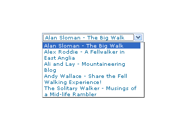
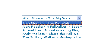
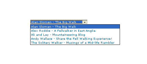
Recently, I spotted a request for a dropdown list like that which you see below. I managed to create it using the CSS, but it only worked for Firefox, so I couldn't suggest it to the requester.
form select, form select option {width: 185px; white-space: normal;}
form select {height: 16px; width: 200px; white-space: normal;}
form {margin: 300px auto 0 auto; width: 300px;}
Here's how it looks in Firefox 2:
And in IE6:
And in Opera 9:
It would be nice if the white-space attribute gave the same result in all three but hey ho... As it happens, the W3C are working up other possible ways of controlling text wrapping in (X)HTML elements, but that's for the future, and I'll be expecting it when I see it.
For menus with wrapped entries, using DHTML menus and DOM scripting seems the best course for now. I suppose that you could always make the entries shorter, which is precisely what I tend to do; I am pragmatic like that. Nevertheless, there's never any harm in attempting to push the boundaries. You just have to come away from the cutting edge at the first sign of bleeding...
Of course, if anyone had other ideas, please let me know.
7th June 2007
When I started it, my online photo gallery started out simply as a set of interlinked HTML pages. Over time, I discovered frames (yes, them!) and started to make use of JavaScript to make the slideshows slicker. In those days, I was working off free webspace provided by my ISP and client-side scripting was the only tool that I had for enhancing functionality. Having tired of the vagaries of client-side scripting while the browser wars were in full swing and incompatibilities reigned supreme, I went with paid hosting to get access to tools like Perl and PHP for server-side processing. Because their flexibility compared to JavaScript was a breath of fresh air to me, I am still a fan of the server-side approach.
The journey that I have just described is one that I now know was followed by many website builders around the same time. Nevertheless, I have still held on to JavaScript for some things, particularly for updating the DOM as part of making the pages more responsive to user interaction. In the last few years, a hybrid approach has been gaining currency: AJAX. This offers the ability to modify parts of a page without needing to reload the whole thing, generating a considerable amount of interest among web application developers.
The world of AJAX is evidently a complex one, though the underlying principle can be explained in simple terms. The essential idea is that you use JavaScript to call a server-side script, PHP is as good an example as any, that returns either text or XML that can be used to update part of a web page in situ without the need to reload it as per the traditional way of working. It has opened up so many possibilities from the interface design point of view that AJAX became a hot topic that still receives much attention today. One bugbear is efficiency because I have seen an AJAX application lock up a PC with a little help from IE6. There will always remain times when server-side processing is the best route, even if that needs to be balanced against the client-side approach.
Like its forbear DHTML, AJAX is really a development approach using a number of different technologies in combination. The DHTML elements such as (X)HTML, CSS, DOM and JavaScript are very much part of the AJAX world but server-side elements such as HTTP, PHP, MySQL and XML are also very much part of the fabric of the landscape. In fact, while AJAX can use plain text as the transfer format, XML is the one implied by the AJAX acronym and XSLT is used to transform XML into HTML. However, AJAX is not limited to the aforementioned technologies; for instance, I cannot see why Perl cannot play a role in place of PHP and ASP, both of which can be used for the same things.
Even in these standards-compliant days, browser support for AJAX remains diverse, to say the least, and it is akin to having MSIE in one corner and the rest in the other. Mind you, Microsoft did introduce the tools in the first place only for them to use ActiveX, while Mozilla created a new object type rather than continue this method of operation. Given that ActiveX is a Windows-only technology, I can see why Mozilla did what they did, and it is a sensible decision. In fact, IE7 appears to have picked up the Mozilla way of doing things.
Even with the apparent convergence, there will continue to be a need for the AJAX JavaScript libraries that are currently out there. Incidentally, Adobe has included one called Spry with Dreamweaver CS3. Nevertheless, I still like to find out how things work at the basic level and feel somewhat obstructed when I cannot do this. I remember perusing Wrox’s Professional AJAX and found the constant references to the associated function library rather grating; the writing style didn’t help either.
My taking a more granular approach has got me reading SAMS Teach Yourself AJAX in 10 Minutes as a means for getting my foot in the door. As with their Teach Yourself … in 24 Hours series, the title is a little misleading since there are 22 lessons of 10 minutes in duration (the 24 Hours moniker refers to there being 24 lessons, each of one hour in length). Anything composed of 10-minute lessons, even 22 of them, is never going to be comprehensive but, as a means for getting started, I have to say that the approach seems effective based on this volume. It has certainly whetted my appetite for giving AJAX a go, and it’ll be interesting to see how things progress from here.
11th May 2007
When I have been tweaking the widgets in this blog, the thought crossed my mind that purveyors of open source blogging and CMS's may be overcomplicating matters with the CSS that they are writing. Using inheritance without much thought as to others having to pick it up is one irritation, but bunching styles together can confuse too. For instance, you can draw from two different styles for the same HTML element (it's what's going when you see class="class1 class2" in a tag definition), which is OK if done simply but can confuse matters when customisation is attempted later. Drupal particularly suffers from this bugbear, but it's there on WordPress too, though not to the same extent. Using a hierarchy to define and attach your styles (#id1 .class2 tag1 {style definition...} is the kind of thing that I have in mind), can also confound, even if I admit to finding the approach very useful for myself. I think that I know what's driving this: the need to cut down the bulk of CSS files but using the advanced features that I mentioned above without clear commenting and other documentation hampers later efforts. It would be nice if every developer of a theme to use in blogging or CMS software was forced to document their work extensively and share that documentation with interested users. After all, sharing is the whole purpose of their endeavours...
23rd March 2007
Having been on a web-building journey from Geocities to having a website with my own domain hosted by Fasthosts, it should come as no surprise that I have encountered a number of tools and technologies over this time and that my choices and knowledge have evolved too. I’ll muse over the technologies first before going on to the tools that I use.
Technologies
XHTML
When I started building websites, it was not after HTML 4 got released, and I devoured most if not all of Elizabeth Castro’s Peachpit Visual Quickstart guide to the language within a weekend. Having previously used fairly primitive WYSIWYG tools like Netscape Composer and Claris Home Page, it was an empowering experience and the first edition (it is now on its third) of Jennifer Niederst Robbins’ Web Design in a Nutshell took things much further, becoming something of a bible for a number of years.
When it first appeared, XHTML 1.0 wasn’t a major change from HTML 4, but its stricter more XML-compliant syntax was meant to point the way to the future and semantic markup was at its heart at least as much as it was for HTML 4. XHTML 2.0 is on the horizon and after the modular approach of XHTML 1.1 (which I have never used), it will be interesting to see how it develops. Nevertheless, there is a surprising development in that some people are musing over the idea of having an HTML 5. Let’s hope that the (X)HTML apple cart doesn’t get completely overturned after some years of relative stability. I still bear scars from the browser wars raging in the 1990’s and don’t want to see standards wars supplanting the relative peace that we have now. That said, I don’t mind peaceful progression.
CSS
Only seems to be coming into its own in the last few years and is truly a remarkable technology despite the hobbles that MSIE places on our ambitions. CSS Zen Garden has been a major source of ideas; I wouldn’t have been able to customise this blog as much as I have without them. I was an early adopter of the technology and got burnt by inconsistent browser support; Netscape 4 was the proverbial bête noir back then, fulfilling the role that MSIE plays today. In those days, it was the idea of controlling text display and element backgrounds from a single place that appealed. Since then, I have progressed to using CSS to replace table-based layouts and to control element positioning. It can do more…
JavaScript
Having had a JavaScript-powered photo gallery before my current Perl-driven one, I can say that I have definitely sampled this ever-pervasive scripting language. Being a client-side language rather than a server-side one, it does place you rather at the mercy of the browser purveyors, and it never ceases to amaze me that there is a buzz around AJAX because of this. In fact, the abundance of AJAX cross-browser function libraries is testimony to the need for browser-specific code. Despite my preferences for server-side scripting, I still find a use for JavaScript, and its main use for me these days is to dynamically control CSS elements to do such things as control the height of a page element or whether it is shown or not. Apparently, CSS may get some dynamic capabilities in the future and reduce my dependence on JavaScript. Meanwhile, Jeremy Keith’s DOM Scripting (Friends of Ed) will prove as much of an asset as it has done.
XML
These days, a lot of the raw data underlying my personal website is stored in XML. I did try to dynamically transform the display of the XML into something meaningful with CSS and XSLT when I first scaled its dizzy heights, but I soon resorted to other techniques. Browser support and the complexity of what I required were the major contributors to this. The new strategy involved two different approaches. The first was to create PHP/XHTML pages from the precursor XML offline, and this is how I generate the website’s directory pages. The other one is to process the XML as text to dynamically supply an XHTML page as the user visits it; this is the way that the photo gallery works.
Perl
This still powers all of my photo gallery. While thoughts of changing it all to PHP linger, there is a certain something about the Perl language that keeps it there. I suppose it is that PHP is entangled in the HTML while Perl encases the whole business, and I am reasonably familiar with its syntax these days, which is why it still does a lot of the data processing grunt work that I need.
PHP
PHP is everywhere these days, though it doesn’t attract quite the level of hype that used to be the case. It still appears with its sidekick MySQL in many website applications. Blogging software such as WordPress and content management systems like Drupal, Mambo and Joomla! wouldn’t exist without the pair. It appears on my website as the glue that holds my visitor directories together and is the processing engine of my WordPress blog. And if I ever get to a Drupal element to the site, by no means a foregone conclusion though I am spending a lot of time with it at this time, PHP will continue its presence in my website scripting as it powers that too.
Applications
Macromedia HomeSite
I have a liking for hand coding, so this does most of what I need. When Macromedia (itself since taken over by Adobe, of course) took over Allaire, HomeSite sadly lost its WYSIWYG capability, but the application still soldiers on even though Dreamweaver offers a lot to code cutters these days. Nevertheless, it does have certain advantages over Dreamweaver: it is a fleeter beast to start up and colour codes Perl syntax.
Macromedia Dreamweaver
There was a time when Dreamweaver was solely a tool for visual web page development, but the advent of Dreamweaver UltraDev added server-side development capabilities to the Dreamweaver family. These days, there is only one Dreamweaver version, but UltraDev’s capabilities still live on in the latest version and I would not be surprised if they were taken further in these database-driven times.
Nowadays, Dreamweaver isn’t an application where I spend a great deal of time. In former times, when my site was made up of static HTML pages, I used Dreamweaver a lot, even if its rendering capabilities were a step behind the then-current browser versions. I suppose that it didn’t fit the way in which I worked, but its template-driven workflow would have been a boon back then.
However, my move from a static site to a dynamic one, starting with my photo gallery, has meant that I haven’t used it as much since then. However, with my use of PHP/MySQL components on my site. Its server-side abilities could get the level of investigation that its PHP/MySQL capabilities allow.
Altova XMLSpy Professional
Adding MySQL databases to my web hosting costs money, not a lot, but it could be spent on other (more important?) things. Hence, I use XML as the data store for my photo gallery and XML files are pre-processed into XHTML/PHP pages for my visitor directories before uploading onto the server.
I use XMLSpy to edit and manage the XML files that I use: its ability to view XML in grid format is a killer feature as far as I am concerned and XML validation also proves very useful; particularly when it comes to ensuring that DTD’s and XML files are in step and for the correct coding of XSLT files. There are other features that I need to explore and that would also take my knowledge of the XML further to boot, not at all a bad thing.
Saxon
For processing XML into another file format such as XHTML, you need a parser and I use the free version of Saxon to do the needful, Saxonica offers commercial versions of it. There is, I believe, a parser in XMLSpy, but I don’t use it because Saxon’s command line interface fits better into my workflow. This is a Perl-driven process where XML files are read and XSLT files, one per XML file, are built before both are fed to Saxon for transforming into XHTML/PHP files. It all works smoothly and updating the XML inputs is all that is required.
AceFTP
If I were looking for an FTP client now, it would be FileZilla, but AceFTP has served me well over the last few years, and it looks as if that will continue. It does have some extra features over FileZilla: transfers between remote sites, and scheduling, for example. I have yet to use either, but they look valuable.
Hutmil
In bygone days when I had loads of static HTML files, making changes was a bit of a chore if they affected every single file. An example is changing the year on the copyright message on the page footers. Hutmil, which I found on a magazine cover-mounted disc, was a great time saver in those days. Today, I achieve this by putting this information into a single file and getting Perl or PHP to import that when building the page. The same “define once, use anywhere” approach underlies CSS as well, and scripting very usefully allows you to take that into the XHTML domain.
Apache
Apache is ubiquitous these days, and both the online and offline versions of my site are powered by it. It does require some configuration, but it is a powerful piece of kit. The introduction of 2.2.x meant a big change in the way that configuration files were modularised and while most things were contained in a single file for 2.0.x, the settings are broken up into different files in 2.2.x, and it can take a while to find things again. Without having it on my home PC, I would not be able to use Perl, PHP or MySQL. Apart from this, I especially like its virtual site capability; very useful for offline development.
WordPress
My hosting supplier offers blogs on Blogware, but that didn’t offer the level of configuration that I would have liked. It is true that this is probably true of any host of blogs. I can’t speak for Blogger, but WordPress.com does have its restrictions too. To make my hillwalking blog fit in with the appearance of my photo gallery, I went popped over to WordPress.org to download WordPress so that I could host a blog myself and have maximum control over its appearance. WordPress supports themes, so I created my own and got my blog pages looking as if they are part of my website, rather than looking like something that was bolted on. Now that I think of it, what about WordPress supporting user-created themes? I support that there is the worry of insecure PHP code but what about it?
MySQL
I am between minds on whether this is a technology or a tool. SQL certainly would be a technology standard, but I am not so clear on what MySQL would be. In any case, I have classed it as a tool, and a very useful one at that. It is the linchpin for my WordPress blogs and, if I go for a content management system like Drupal, its role would surely grow. While I do have a lot of experience with using SAS SQL and this helps me to deal with other varieties, there is still a learning curve with MySQL that gets me heading for a good book and Kofler’s The Definitive Guide to MySQL5 (Apress) seems to perform more than adequately in this endeavour.
Paint Shop Pro
As someone who hosts an online photo gallery, it won’t come as a surprise that I have had exposure to image editors. Despite various other flirtations, Paint Shop Pro has been my tool of choice over the years, but it is now set to be usurped by a member of Adobe’s Photoshop family. Paint Shop Pro does have books devoted to it, but it appears that Photoshop gets better coverage and I feel that my image processing needs to be taken up a gear, hence the potential move to Photoshop