TOPIC: CSS
Another way to control line breaks in (X)HTML
While you can use <br /> tags, there is another way to achieve similar results: the or non-breaking space entity. Put one of them between two words, and you stop them getting separated by a line break; I have been using this in the latest design tweaks that I made to my online photo gallery. Turning this on its head, if you see two words together acting without regard to normal wrapping conventions, then you can suspect that a non-breaking space could be a cause. There might be CSS options too, but their effectiveness in different browsers may limit their usefulness.
position: static?
CSS positioning seems to be becoming a nightmare when it comes to IE6 support. While I am aware that the likes of 37signals have stopped making their products work with it, there remain plenty of people who stick or are stuck with the old retainer. I am one of the latter because of the continued use of Windows 2000 at my place of work, though a Windows Vista roll-out has been mooted for a while now. If nothing else, it keeps me in the loop for any inconsistencies that afflict the display of my websites. Positioning of an element within the browser window rather than within its parent element is one of these, and it looks as if specifying a position of relative in a stylesheet is part of this. Apparently, it could be down to its non-triggering of IE's haslayout property. Though it might be a hack, I have found that static positioning has helped. While I'll continue to keep my eye out for a better solution if it exists, the static option seems to have no detrimental effect in IE7, IE8, Firefox, Safari, Chrome or Opera.
New version of my Countrytones plugin
Now that WordPress 2.6 is out, it is time to introduce a new version of Countrytones to the public. A few CSS tweaks have been needed to the original version after the changes that have been made to the administration interface for 2.6. Those screens still look largely the same with this release as they did before, but for the styling of things like the bubble that alerts you to the availability of plugin upgrades, among other things.
Eliminating Peekaboo content display problems in Internet Explorer
Recently, I changed the engine of my online photo gallery to a speedier PHP/MySQL-based affair from its PHP/Perl/XML-powered predecessor. On the server side, all was well, but a peculiar display issue turned up in Internet Explorer (6, 7 & 8 were afflicted by this behaviour) where photo caption text on the thumbnail gallery pages was being displayed erratically.
As far as I can gather, the trigger for the behaviour was that the thumbnail block was placed within a DIV floated using CSS that touched another DIV that cleared the floating behaviour. I use a table to hold the images and their associated captions in place. Furthermore, each caption was also a hyperlink nested within a set of P tags.
The remedy was to set the CSS Display property for the affected XHTML tag to a value of "inline-block". Within a DIV, TABLE, TR, TD, P and A tag hierarchy, finding the right tag where the CSS property in question has the desired effect took some doing. As it happened, it was the tag set, that for the hyperlink, at the bottom of the stack that needed the fix.
Of course, it's all very fine fixing something for one browser, but it's worthless if it breaks the presentation in other browsers. In that vein, I did some testing in Opera, Firefox, Seamonkey and Safari to check if all was well and it was. There may be older browsers, like versions of IE before 6, where things don't appear as intended, yet I get the impression from my visitor statistics that the newer variants hold sway anyway. All in all, it was a useful lesson learnt, and that's never a bad thing.
Opera and table display
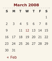
I have encountered something very strange with my hillwalking blog, and I have to admit that am at something of a loss as to how to resolve it. Opera (version 9.x), it seems, is not displaying the date corresponding to the first post of a particular month. You can see the effect on the right for the current month and, yes, the tenth of the month has a post associated with it. What compounds the mystery is that the same issue doesn't affect this blog, so some further investigation is very much in order. However, the cascading element of CSS doesn't help much when trying to track down the cause of this sort of thing. While, it's irritating, I don't have any definite answers yet and so would appreciate some suggestions. Meanwhile, I'll be staying on the lookout for a fix. Curiously, all's fine on Firefox and IE.
Correcting or updating blog posts
Recently, I have grown to notice that certain bloggers are not removing old content from a blog, only striking it through using something like CSS. Though there is a place for this, it does strike me as overkill sometimes and can look untidy. Sometimes, that lack of neatness is a trade-off, since the highlighting of a correction itself conveys a message. While I have been known to tweak posts immediately after publishing without leaving the previous content on view, my changes generally are readability improvements more than anything else. Typos and spelling mistakes also get corrected like this; nobody needs them highlighted for all to see. I am not trying to fool anyone and, if I want to update the content, I either add another post or use another tactic that I have seen others use: updates at the bottom of the post that are denoted as such. It's another transparent approach that preserves the authenticity of the piece.
LVHA…
On my web design journey, I have learned the wisdom that CSS styles for hyperlinks should be defined like the following:
a:link {...}
a:visited {...}
a:hover {...}
a:active {...}
List out the names of the pseudoselectors, and you'll soon work out where they got LVHA: Link, Visited, Hover and Active. However, I have recently spotted the following being used:
a {...}
a:hover {...}
The trick here is to define your style globally and only define specifics for the relevant pseudoselector, hover in this example. It works well in the likes of Mozilla and Opera, but Internet Explorer is another story. Even IE7 needs the LVHA treatment. I spotted this when I observed unexpected changes in the appearance of link text after visiting the link: visited links starts to change colour. While I know that the likes of Jakob Nielsen frown upon non-changing link colour, I choose to ignore this and keep it constant, so following the LVHA approach is needed to keep things as I would like them.
Missing borders in Internet Explorer
It's quite difficult to describe this observation in a title so here goes with a longer description in a post. One thing that I spotted with the Prosumer theme used on this blog is that the links on the horizontal navigation bar underneath the mast head were not appearing as they should. The links have been formatted using CSS to appear in boxes with borders that are more apparent when you hover over them. In IE, the top and bottom borders were missing. After a spot of digging, I came up with the line-height property being the cause, and I was right: the extremities of the boxes surrounding the text were being cut off because they exceeded the allotted space. As if to emphasise that IE7 isn't as major a leap forward from IE6 as we would have liked, the problem affected that browser as well.
Aside: Link text colours weren't being honoured by IE7 like they are by IE6, Firefox and Opera, so another tweak to the CSS was needed.
CSS Control of Text Wrapping
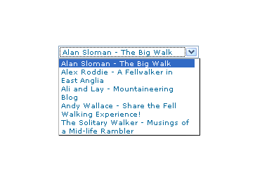
Recently, I spotted a request for a dropdown list like that which you see below. I managed to create it using the CSS, but it only worked for Firefox, so I couldn't suggest it to the requester.
form select, form select option {width: 185px; white-space: normal;}
form select {height: 16px; width: 200px; white-space: normal;}
form {margin: 300px auto 0 auto; width: 300px;}
Here's how it looks in Firefox 2:
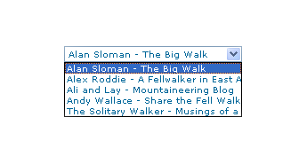
And in IE6:
And in Opera 9:
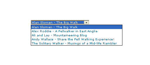
It would be nice if the white-space attribute gave the same result in all three but hey ho... As it happens, the W3C are working up other possible ways of controlling text wrapping in (X)HTML elements, but that's for the future, and I'll be expecting it when I see it.
For menus with wrapped entries, using DHTML menus and DOM scripting seems the best course for now. I suppose that you could always make the entries shorter, which is precisely what I tend to do; I am pragmatic like that. Nevertheless, there's never any harm in attempting to push the boundaries. You just have to come away from the cutting edge at the first sign of bleeding...
Of course, if anyone had other ideas, please let me know.
Are developers and designers overcomplicating their CSS?
When I have been tweaking the widgets in this blog, the thought crossed my mind that purveyors of open source blogging and CMS's may be overcomplicating matters with the CSS that they are writing. Using inheritance without much thought as to others having to pick it up is one irritation, but bunching styles together can confuse too. For instance, you can draw from two different styles for the same HTML element (it's what's going when you see class="class1 class2" in a tag definition), which is OK if done simply but can confuse matters when customisation is attempted later. Drupal particularly suffers from this bugbear, but it's there on WordPress too, though not to the same extent. Using a hierarchy to define and attach your styles (#id1 .class2 tag1 {style definition...} is the kind of thing that I have in mind), can also confound, even if I admit to finding the approach very useful for myself. I think that I know what's driving this: the need to cut down the bulk of CSS files but using the advanced features that I mentioned above without clear commenting and other documentation hampers later efforts. It would be nice if every developer of a theme to use in blogging or CMS software was forced to document their work extensively and share that documentation with interested users. After all, sharing is the whole purpose of their endeavours...