TOPIC: IRELAND
Building a modular Hugo website home page using block-driven front matter
 22nd February 2026
Inspired by building a modular landing page on a Grav-powered subsite, I wondered about doing the same for a Hugo-powered public transport website that I have. It was part of an overall that I was giving it, with AI consultation running shotgun with the whole effort. The home page design was changed from a two-column design much like what was once typical of a blog, to a single column layout with two-column sections.
The now vertical structure consisted of numerous layers. First, there is an introduction with a hero image, which is followed by blocks briefly explaining what the individual sections are about. Below them, two further panels describe motivations and scope expansions. After those, there are two blocks displaying pithy details of recent public transport service developments before two final panels provide links to latest articles and links to other utility pages, respectively.
This was a conscious mix of different content types, with some nesting in the structure. Much of the content was described in page front matter, instead of where it usually goes. Without that flexibility, such a layout would not have been possible. All in all, this illustrates just how powerful Hugo is when it comes to constructing website layouts. The limits essentially are those of user experience and your imagination, and necessarily in that order.
On Hugo Home Pages
Building a home page in Hugo starts with understanding what content/_index.md actually represents. Unlike a regular article file, _index.md denotes a list page, which at the root of the content directory becomes the site's home page. This special role means Hugo treats it differently from a standard single page because the home is always a list page even when the design feels like a one-off.
Front matter in content/_index.md can steer how the page is rendered, though it remains entirely optional. If no front matter is present at all, Hugo still creates the home page at .Site.Home, draws the title from the site configuration, leaves the description empty unless it has been set globally, and renders any Markdown below the front matter via .Content. That minimal behaviour suits sites where the home layout is driven entirely by templates, and it is a common starting point for new projects.
How the Underlying Markdown File Looks
While this piece opens with a description of what was required and built, it is better to look at the real _index.md file. Illustrating the block-driven pattern in practical use, here is a portion of the file:
---
title: "Maximising the Possibilities of Public Transport"
layout: "home"
blocks:
  - type: callout
    text1: "Here, you will find practical, thoughtful insight..."
    text2: "You can explore detailed route listings..."
    image: "images/sam-Up56AzRX3uM-unsplash.jpg"
    image_alt: "Transpennine Express train leaving Manchester Piccadilly train station"
  - type: cards
    heading: "Explore"
    cols_lg: 6
    items:
      - title: "News & Musings"
        text: "Read the latest articles on rail networks..."
        url: "https://ontrainsandbuses.com/news-and-musings/"
      - title: "News Snippets"
        ...
  - type: callout
    heading: "Motivation"
    text2: "Since 2010, British public transport has endured severe challenges..."
    image: "images/joseph-mama-aaQ_tJNBK4c-unsplash.jpg"
    image_alt: "Buses in Leeds, England, U.K."
  - type: callout
    heading: "An Expanding Scope"
    text2: "You will find content here drawn from Ireland..."
    image: "images/snap-wander-RlQ0MK2InMw-unsplash.jpg"
    image_alt: "TGV speeding through French countryside"
---
There are several things that are worth noting here. The title and layout: "home" fields appear at the top, with all structural content expressed as a blocks list beneath them. There is no Markdown body because the blocks supply all the visible content, and the file contains no layout logic of its own, only a description of what should appear and in what order. However, the lack of a Markdown body does pose a challenge for spelling and grammar checking using the LanguageTool extension in VSCode, which means that you need to ensure that proofreading needs to happen in a different way, such as using the editor that comes with the LanguageTool browser extension.
Template Selection and Lookup Order
Template selection is where Hugo's home page diverges most noticeably from regular sections. In Hugo v0.146.0, the template system was completely overhauled, and the lookup order for the home page kind now follows a straightforward sequence: layouts/home.html, then layouts/list.html, then layouts/all.html. Before that release, the conventional path was layouts/index.html first, falling back to layouts/_default/list.html, and the older form remains supported through backward-compatibility mapping. In every case, baseof.html is a wrapper rather than a page template in its own right, so it surrounds whichever content template is selected without substituting for one.
The choice of template can be guided further through front matter. Setting layout: "home" in content/_index.md, as in the example above, encourages Hugo to pick a template named home.html, while setting type: "home" enables more specific template resolution by namespace. These are useful options when the home page deserves its own template path without disturbing other list pages.
The Home Template in Practice
With the front matter established, the template that renders it is worth examining in its own right. It happens that the home.html for this site reads as follows:
<!DOCTYPE html>
{{- partial "head.html" . -}}
<body>
{{- partial "header.html" . -}}
<div class="container main" id="content">
<div class="row">
<h2 class="centre">{{ .Title }}</h2>
{{- partial "blocks/render.html" . -}}
</div>
{{- partial "recent-snippets-cards.html" . -}}
{{- partial "home-teasers.html" . -}}
{{ .Content }}
</div>
{{- partial "footer.html" . -}}
{{- partial "cc.html" . -}}
{{- partial "matomo.html" . -}}
</body>
</html>
This template is self-contained rather than wrapping a base template. It opens the full HTML document directly, calls head.html for everything inside the <head> element and header.html for site navigation, then establishes the main content container. Inside that container, .Title is output as an h2 heading, drawing from the title field in content/_index.md. The block dispatcher partial, blocks/render.html, immediately follows and is responsible for looping through .Params.blocks and rendering each entry in sequence, handling all the callout and cards blocks described in the front matter.
Below the blocks, two further partials render dynamic content independently of the front matter. recent-snippets-cards.html displays the two most recent news snippets as full-content cards, while home-teasers.html presents a compact linked list of recent musings alongside a weighted list of utility pages. After those, {{ .Content }} outputs any Markdown written below the front matter in content/_index.md, though in this case, the file has no body content, so nothing is rendered at that point. The template closes with footer.html, a cookie notice via cc.html and a Matomo analytics snippet.
Notice that this template does not use {{ define "main" }} and therefore does not rely on baseof.html at all. It owns the full document structure itself, which is a legitimate approach when the home page has a sufficiently distinct shape that sharing a base template would add complexity rather than reduce it.
The Block Dispatcher
The blocks/render.html partial is the engine that connects the front matter to the individual block templates. Its full content is brief but does considerable work:
{{ with .Params.blocks }}
  {{ range . }}
    {{ $type := .type | default "text" }}
    {{ partial (printf "blocks/%s.html" $type) (dict "page" $ "block" .) }}
  {{ end }}
{{ end }}
The with .Params.blocks guard means the entire loop is skipped cleanly if no blocks key is present in the front matter, so pages that do not use the system are unaffected. For each block in the list, the type field is read and passed through printf to build the partial path, so type: callout resolves to blocks/callout.html and type: cards resolves to blocks/cards.html. If a block has no type, the fallback is text, so a blocks/text.html partial would handle it. The dict call constructs a fresh context map passing both the current page (as page) and the raw block data (as block) into the partial, keeping the two concerns cleanly separated.
The Callout Blocks
The callout.html partial renders bordered, padded sections that can carry a heading, an image and up to five paragraphs of text. Used for the website introduction, motivation and expanded scope sections, its template is as follows:
{{ $b := .block }}
<section class="mt-4">
  <div class="p-4 border rounded">
    {{ with $b.heading }}<h3>{{ . }}</h3>{{ end }}
    {{ with $b.image }}
      <img
        src="{{ . }}"
        class="img-fluid w-100 rounded"
        alt="{{ $b.image_alt | default "" }}">
    {{ end }}
    <div class="text-columns mt-4">
      {{ with $b.text1 }}<p>{{ . }}</p>{{ end }}
      {{ with $b.text2 }}<p>{{ . }}</p>{{ end }}
      {{ with $b.text3 }}<p>{{ . }}</p>{{ end }}
      {{ with $b.text4 }}<p>{{ . }}</p>{{ end }}
      {{ with $b.text5 }}<p>{{ . }}</p>{{ end }}
    </div>
  </div>
</section>
The pattern here is consistent and deliberate. Every field is wrapped in a {{ with }} block, so fields absent from the front matter produce no output and no empty elements. The heading renders as an h3, sitting one level below the page's h2 title and maintaining a coherent document outline. The image uses img-fluid and w-100 alongside rounded, making it fully responsive and visually consistent with the bordered container. According to the Bootstrap documentation, img-fluid applies max-width: 100% and height: auto so the image scales with its parent, while w-100 ensures it fills the container width regardless of its intrinsic size. The image_alt field falls back to an empty string via | default "" rather than omitting the attribute entirely, which keeps the rendered HTML valid.
Text content sits inside a text-columns wrapper, which allows a stylesheet to apply a CSS multi-column layout to longer passages without altering the template. The numbered paragraph fields text1 through text5 reflect the varying depth of the callout blocks in the front matter: the introductory callout uses two paragraphs, while the Motivation callout uses four. Adding another paragraph field to a block requires only a new {{ with $b.text6 }} line in the partial and a matching text6 key in the front matter entry.
The Section Introduction Blocks
The cards.html partial renders a headed grid of linked blocks, with the column width at large viewports driven by a front matter parameter. This is used for the website section introductions and its template is as follows:
{{ $b := .block }}
{{ $colsLg := $b.cols_lg | default 4 }}
<section class="mt-4">
  {{ with $b.heading }}<h3 class="h4 mb-3">{{ . }}</h3>{{ end }}
  <div class="row">
    {{ range $b.items }}
      <div class="col-12 col-md-6 col-lg-{{ $colsLg }} mb-3">
        <div class="card h-100 ps-2 pe-2 pt-2 pb-2">
          <div class="card-body">
            <h4 class="h5 card-title mt-1 mb-2">
              <a href="{{ .url }}">{{ .title }}</a>
            </h4>
            {{ with .text }}<p class="card-text mb-0">{{ . }}</p>{{ end }}
          </div>
        </div>
      </div>
    {{ end }}
  </div>
</section>
The cols_lg value defaults to 4 if not specified, which produces a three-column grid at large viewports using Bootstrap's twelve-column grid. The transport site's cards block sets cols_lg: 6, giving two columns at large viewports and making better use of the wider reading space for six substantial card descriptions. At medium viewports, the col-md-6 class produces two columns regardless of cols_lg, and col-12 ensures single-column stacking on small screens.
The heading uses the h4 utility class on an h3 element, pulling the visual size down one step while keeping the document outline correct, since the page already has an h2 title and h3 headings in the callout blocks. Each card title then uses h5 on an h4 for the same reason. The h-100 class on the card sets its height to one hundred percent of the column, so all cards in a row grow to match the tallest one and baselines align even when descriptions vary in length. The padding classes ps-2 pe-2 pt-2 pb-2 add a small inset without relying on custom CSS.
Brief Snippets of Recent Public Transport Developments
The recent-snippets-cards.html partial sits outside the blocks system and renders the most recent pair of short transport news posts as full-content cards. Here is its template:
<h3 class="h4 mt-4 mb-3">Recent Snippets</h3>
<div class="row">
  {{ range ( first 2 ( where .Site.Pages "Type" "news-snippets" ) ) }}
    <div class="col-12 col-md-6 mb-3">
      <div class="card h-100">
        <div class="card-body">
          <h4 class="h6 card-title mt-1 mb-2">
            {{ .Date.Format "15:04, January 2" }}<sup>{{ if eq (.Date.Format "2") "2" }}nd{{ else if eq (.Date.Format "2") "22" }}nd{{ else if eq (.Date.Format "2") "1" }}st{{ else if eq (.Date.Format "2") "21" }}st{{ else if eq (.Date.Format "2") "3" }}rd{{ else if eq (.Date.Format "2") "23" }}rd{{ else }}th{{ end }}</sup>, {{ .Date.Format "2006" }}
          </h4>
          <div class="snippet-content">
            {{ .Content }}
          </div>
        </div>
      </div>
    </div>
  {{ end }}
</div>
The where function filters .Site.Pages to the news-snippets content type, and first 2 takes only the two most recently created entries. Notably, this collection does not call .ByDate.Reverse before first, which means it relies on Hugo's default page ordering. Where precise newest-first ordering matters, chaining ByDate.Reverse before first makes the intent explicit and avoids surprises if the default ordering changes.
The date heading warrants attention. It formats the time as 15:04 for a 24-hour clock display, followed by the month name and day number, then appends an ordinal suffix using a chain of if and else if comparisons against the raw day string. The logic handles the four irregular cases (1st, 21st, 2nd, 22nd, 3rd and 23rd) before falling back to th for all other days. The suffix is wrapped in a <sup> element so it renders as a superscript. The year follows as a separate .Date.Format "2006" call, separated from the day by a comma. Each card renders the full .Content of the snippet rather than a summary, which suits short-form posts where the entire entry is worth showing on the home page.
Latest Musings and Utility Pages Blocks
The home-teasers.html partial renders a two-column row of linked lists, one for recent long-form articles and one for utility pages. Its template is as follows:
<div class="row mt-4">
<div class="col-12 col-md-6 mb-3">
<div class="card h-100">
<div class="card-body">
<h3 class="h5 card-title mb-3">Recent Musings</h3>
{{ range first 5 ((where .Site.RegularPages "Type" "news-and-musings").ByDate.Reverse) }}
<p class="mb-2">
<a href="{{ .Permalink }}">{{ .Title }}</a>
</p>
{{ end }}
</div>
</div>
</div>
<div class="col-12 col-md-6 mb-3">
<div class="card h-100">
<div class="card-body">
<h3 class="h5 card-title mb-3">Extras & Utilities</h3>
{{ $extras := where .Site.RegularPages "Type" "extras" }}
{{ $extras = where $extras "Title" "ne" "Thank You for Your Message!" }}
{{ $extras = where $extras "Title" "ne" "Whoops!" }}
{{ range $extras.ByWeight }}
<p class="mb-2">
<a href="{{ .Permalink }}">{{ .Title }}</a>
</p>
{{ end }}
</div>
</div>
</div>
</div>The left column uses .Site.RegularPages rather than .Site.Pages to exclude list pages, taxonomy pages and other non-content pages from the results. The news-and-musings type is filtered, sorted with .ByDate.Reverse and then limited to five entries with first 5, producing a compact, current list of article titles. The heading uses h5 on an h3 for the same visual-scale reason seen in the cards blocks, and h-100 on each card ensures the two columns match in height at medium viewports and above.
The right column builds the extras list through three chained where calls. The first narrows to the extras content type, and the subsequent two filter out utility pages that should never appear in public navigation, specifically the form confirmation and error pages. The remaining pages are then sorted by ByWeight, which respects the weight value set in each page's front matter. Pages without a weight default to zero, so assigning small positive integers to the pages that should appear first gives stable, editorially controlled ordering without touching the template.
Diagnosing Template Choices
Diagnosing which template Hugo has chosen is more reliable with tooling than with guesswork. Running the development server with debug output reveals the selected templates in the terminal logs. Another quick technique is to place a visible marker in a candidate file and inspect the page source.
HTML comments are often stripped during minified builds, and Go template comments never reach the output, so an innocuous meta tag makes a better marker because a minifier will not remove it. If the marker does not appear after a rebuild, either the template being edited is not in use because another file higher in the lookup order is taking precedence, or a theme is providing a matching file without it being obvious.
Front Matter Beyond Layout
Front matter on the home page earns its place when it supplies values that make their way into head tags and structured sections, rather than when it tries to replicate layout logic. A brief description is valuable for metadata and social previews because many base templates output it as a meta description tag. Where a site uses social cards, parameters for images and titles can be added and consumed consistently.
Menu participation also remains available to the home page, with entries in front matter allowing the home to appear in navigation with a given weight. Less common but still useful fields include outputs, which can disable or configure output formats, and cascade, which can provide defaults to child pages when site-wide consistency matters. Build controls can influence whether a page is rendered or indexed, though these are rarely changed on a home page once the structure has settled.
Template Hygiene
Template hygiene pays off throughout this process. Whether the home page uses a self-contained template or wraps baseof.html, the principle is the same: each file should own a clearly bounded responsibility. The home template in the example above does this well, with head.html, header.html and footer.html each handling their own concerns, and the main content area occupied by the blocks dispatcher and the two dynamic partials. Column wrappers are easiest to manage when each partial opens and closes its own structure, rather than relying on a sibling to provide closures elsewhere.
That self-containment prevents subtle layout breakage and means that adding a new block type requires only a small partial in layouts/partials/blocks/ and a new entry in the front matter blocks list, with no changes to any existing template. Once the home page adopts this pattern, the need for CSS overrides recedes because the HTML shape finally expresses intent instead of fighting it.
Bootstrap Utility Classes in Summary
Understanding Bootstrap's utility classes rounds off the technique because these classes anchor the modular blocks without the need for custom CSS. h-100 sets height to one hundred percent and works well on cards inside a flex row so that their bottoms align across a grid, as seen in both the cards block and the home teasers. The h4, h5 and h6 utilities apply a different typographic scale to any element without changing the document outline, which is useful for keeping headings visually restrained while preserving accessibility. img-fluid provides responsive behaviour by constraining an image to its container width and maintaining aspect ratio, and w-100 makes an image or any element fill the container width even if its intrinsic size would let it stop short. Together, these classes produce predictable and adaptable blocks that feel consistent across all viewports.
Closing Remarks
The result of combining Hugo's list-page model for the home, a block-driven front matter design and Bootstrap's light-touch utilities is a home page that reads cleanly and remains easy to extend. New block types become a matter of adding a small partial and a new blocks entry, with the dispatcher handling the rest automatically. Dynamic sections such as recent snippets sit in dedicated partials called directly from the template, updating without any intervention in content/_index.md. Existing sections can be reordered without editing templates, shared structure remains in one place, and the need for brittle CSS customisation fades because the templates do the heavy lifting.
A final point returns to content/_index.md. Keeping front matter purposeful makes it valuable. A title, a layout directive and a blocks list that models the editorially controlled page structure are often enough, as we have seen in this example from my public transport website. More seldom-used fields such as outputs, cascade and build remain available should a site require them, but their restraint reflects the wider approach: let content describe structure, let templates handle layout and avoid unnecessary complexity.
Creating modular pages in Grav CMS
14th February 2026
Here is a walkthrough that demonstrates how to create modular pages in Grav CMS. Modular pages allow you to build complex, single-page layouts by stacking multiple content sections together. This approach works particularly well for modern home pages where different content types need to be presented in a specific sequence. The example here stems from building a theme from scratch to ensure sitewide consistency across multiple subsites.
What Are Modular Pages
A modular page is a collection of content sections (called modules) that render together as a unified page. Unlike regular pages that have child pages accessible via separate URL's, modular pages display all their modules on a single URL. Each module is a self-contained content block with its own folder, markdown file and template. The parent page assembles these modules in a specified order to create the final page.
Understanding the Folder Structure
Modular pages use a specific folder structure. The parent folder contains a modular.md file that defines which modules to include and in what order. Module folders sit beneath the parent folder and are identified by an underscore at the start of their names. Numeric prefixes before the underscore control the display order.
Here is an actual folder structure from a travel subsite home page:
/user/pages/01.home/
    01._title/
    02._intro/
    03._call-to-action/
    04._ireland/
    05._england/
    06._scotland/
    07._scandinavia/
    08._wales-isle-of-man/
    09._alps-pyrenees/
    10._american-possibilities/
    11._canada/
    12._dreams-experiences/
    13._practicalities-inspiration/
    14._feature_1/
    15._feature_2/
    16._search/
    modular.md
The numeric prefixes (01, 02, 03) ensure modules appear in the intended sequence. The descriptive names after the prefix (_title, _ireland, _search) make the page structure immediately clear. Each module folder contains its own markdown file and any associated media. The underscore prefix tells Grav these folders contain modules rather than regular pages. Modules are non-routable, meaning visitors cannot access them directly via URLs. They exist only to provide content sections for their parent page.
The Workflow
Step One: Create the Parent Page Folder
Start by creating a folder for your modular page in /user/pages/. For a home page, you might create 01.home. The numeric prefix 01 ensures this page appears first in navigation and sets the display order. If you are using the Grav Admin interface, navigate to Pages and click the Add button, then select "Modular" as the page type.
Create a file named modular.md inside this folder. The filename is important because it tells Grav to use the modular.html.twig template from your active theme. This template handles the assembly and rendering of your modules.
Step Two: Configure the Parent Page
Open modular.md and add YAML front matter to define your modular page settings. Here is an example configuration:
---
title: Home
menu: Home
body_classes: "modular"

content:
    items: '@self.modular'
    order:
        by: default
        dir: asc
        custom:
            - _hero
            - _features
            - _callout
---
The content section is crucial. The items: '@self.modular' instruction tells Grav to collect all modules from the current page. The custom list under order specifies exactly which modules to include and their sequence. This gives you precise control over how sections appear on your page.
Step Three: Create Module Folders
Create folders for each content section you need. Each folder name must begin with an underscore. Add numeric prefixes before the underscore for ordering, such as 01._title, 02._intro, 03._call-to-action. The numeric prefixes control the display sequence. Module names are entirely up to you based on what makes sense for your content.
For multi-word module names, use hyphens to separate words. Examples include 08._wales-isle-of-man, 10._american-possibilities or 13._practicalities-inspiration. This creates readable folder names that clearly indicate each module's purpose. The official documentation shows examples using names like _features and _showcase. It does not matter what names that you choose, as long as you create matching templates. Descriptive names help you understand the page structure when viewing the file system.
Step Four: Add Content to Modules
Inside each module folder, create a markdown file. The filename determines which template Grav uses to render that module. For example, a module using text.md will use the text.html.twig template from your theme's /templates/modular/ folder. You decide on these names when planning your page structure.
Here is an actual example from the 04._ireland module:
---
title: 'Irish Encounters'
content_source: ireland
grid: true
sitemap:
    lastmod: '30-01-2026 00:26'
---
### Irish Encounters {.mb-3}
<p style="text-align:center" class="mt-3"><img class="w-100 rounded" src="https://www.assortedexplorations.com/photo_gallery_images/eire_kerry/small_size/eireCiarraigh_tomiesMountain.jpg" /></p>
From your first arrival to hidden ferry crossings and legendary names that shaped the world, these articles unlock Ireland's layers beyond the obvious tourist trail. Practical wisdom combines with unexpected perspectives to transform a visit into an immersive journey through landscapes, culture and connections you will not find in standard guidebooks.
The front matter contains settings specific to this module. The title appears in the rendered output. The content_source: ireland tells the template which page to link to (as shown in the text.html.twig template example). The grid: true flag signals the modular template to render this module within the grid layout. The sitemap settings control how search engines index the content.
The content below the front matter appears when the module renders. You can use standard Markdown syntax for formatting. You can also include HTML directly in markdown files for precise control over layout and styling. The example above uses HTML for image positioning and Bootstrap classes for responsive sizing.
Module templates can access front matter variables through page.header and use them to generate dynamic content. This provides flexibility in how modules appear and behave without requiring separate module types for every variation.
Step Five: Create Module Templates
Your theme needs templates in /templates/modular/ that correspond to your module markdown files. When building a theme from scratch, you create these templates yourself. A module using hero.md requires a hero.html.twig template. A module using features.md requires a features.html.twig template. The template name must match the markdown filename.
Each template defines how that module's content renders. Templates use standard Twig syntax to structure the HTML output. Here is an example text.html.twig template that demonstrates accessing page context and generating dynamic links:
{{ content|raw }}
{% set raw = page.header.content_source ?? '' %}
{% set route = raw ? '/' ~ raw|trim('/') : page.parent.route %}
{% set context = grav.pages.find(route) %}
{% if context %}
    <p>
        <a href="{{ context.url }}" class="btn btn-secondary mt-3 mb-3 shadow-none stretch">
            {% set count = context.children.visible|length + 1 %}
            Go and Have a Look: {{ count }} {{ count == 1 ? 'Article' : 'Articles' }} to Savour
        </a>
    </p>
{% endif %}
First, this template outputs the module's content. It then checks for a content_source variable in the module's front matter, which specifies a route to another page. If no source is specified, it defaults to the parent page's route. The template finds that page using grav.pages.find() and generates a button linking to it. The button text includes a count of visible child pages, with proper singular/plural handling.
The Grav themes documentation provides guidance on template creation. You have complete control over the design and functionality of each module through its template. Module templates can access the page object, front matter variables, site configuration and any other Grav functionality.
Step Six: Clear Cache and View Your Page
After creating your modular page and modules, clear the Grav cache. Use the command bin/grav clear-cache from your Grav installation directory, or click the Clear Cache button in the Admin interface. The CLI documentation details other cache management options.
Navigate to your modular page in a browser. You should see all modules rendered in sequence as a single page. If modules do not appear, verify the underscore prefix on module folders, check that template files exist for your markdown filenames and confirm your parent modular.md lists the correct module names.
Working with the Admin Interface
The Grav Admin plugin streamlines modular page creation. Navigate to the Pages section in the admin interface and click Add. Select "Add Modular" from the options. Fill in the title and select your parent page. Choose the module template from the dropdown.
The admin interface automatically creates the module folder with the correct underscore prefix. You can then add content, configure settings and upload media through the visual editor. This approach reduces the chance of naming errors and provides a more intuitive workflow for content editors.
Practical Tips for Modular Pages
Use descriptive folder names that indicate the module's purpose. Names like 01._title, 02._intro, 03._call-to-action make the page structure immediately clear. Hyphens work well for multi-word module names such as 08._wales-isle-of-man or 13._practicalities-inspiration. This naming clarity helps when you return to edit the page later or when collaborating with others. The specific names you choose are entirely up to you as the theme developer.
Keep module-specific settings in each module's markdown front matter. Place page-wide settings like taxonomy and routing in the parent modular.md file. This separation maintains clean organisation and prevents configuration conflicts.
Use front matter variables to control module rendering behaviour. For example, adding grid: true to a module's front matter can signal your modular template to render that module within a grid layout rather than full-width. Similarly, flags like search: true or fullwidth: true allow your template to apply different rendering logic to different modules. This keeps layout control flexible without requiring separate module types for every layout variation.
Test your modular page after adding each new module. This incremental approach helps identify issues quickly. If a module fails to appear, check the folder name starts with an underscore, verify the template exists and confirm the parent configuration includes the module in its custom order list.
For development work, make cache clearing a regular habit. Grav caches page collections and compiled templates, which can mask recent changes. Running bin/grav clear-cache after modifications ensures you see current content rather than cached versions.
Understanding Module Rendering
The parent page's modular.html.twig template controls how modules assemble. Whilst many themes use a simple loop structure, you can implement more sophisticated rendering logic when building a theme from scratch. Here is an example that demonstrates conditional rendering based on module front matter:
{% extends 'partials/home.html.twig' %}
{% block content %}
  {% set modules = page.collection({'items':'@self.modular'}) %}
  {# Full-width modules first (search, main/outro), then grid #}
  {% for m in modules %}
    {% if not (m.header.grid ?? false) %}
      {% if not (m.header.search ?? false) %}
            {{ m.content|raw }}
      {% endif %}
    {% endif %}
  {% endfor %}
  <div class="row g-4 mt-3">
    {% for m in modules %}
      {% if (m.header.grid ?? false) %}
        <div class="col-12 col-md-6 col-xl-4">
          <div class="h-100">
            {{ m.content|raw }}
          </div>
        </div>
      {% endif %}
    {% endfor %}
  </div>
  {# Move search box to end of page  #}
  {% for m in modules %}
    {% if (m.header.search ?? false) %}
          {{ m.content|raw }}
    {% endif %}
  {% endfor %}
{% endblock %}
This template demonstrates several useful techniques. First, it retrieves the module collection using page.collection({'items':'@self.modular'}). The template then processes modules in three separate passes. The first pass renders full-width modules that are neither grid items nor search boxes. The second pass renders grid modules within a Bootstrap grid layout, wrapping each in responsive column classes. The third pass renders the search module at the end of the page.
Modules specify their rendering behaviour through front matter variables. A module with grid: true in its front matter renders within the grid layout. A module with search: true renders at the page bottom. Modules without these flags render full-width at the top. This approach provides precise control over the layout whilst keeping content organised in separate module files.
Each module still uses its own template (like text.html.twig or feature.html.twig) to define its specific HTML structure. The modular template simply determines where on the page that content appears and whether it gets wrapped in grid columns. This separation between positioning logic and content structure keeps the system flexible and maintainable.
When to Use Modular Pages
Modular pages work well for landing pages, home pages and single-page sites where content sections need to appear in a specific order. They excel at creating modern, scrollable pages with distinct content blocks like hero sections, feature grids, testimonials and call-to-action areas.
For traditional multipage sites with hierarchical navigation, regular pages prove more suitable because modular pages do not support child pages in the conventional sense. Instead, choose modular pages when you need a unified, single-URL presentation of multiple content sections.
Related Reading
For further information, consult the Grav Modular Pages Documentation, Grav Themes and Templates guide and the Grav Admin Plugin documentation.
A round-up of online portals for those seeking work
5th August 2025
For me, much of 2025 was spent finding a new freelance work engagement. Recently, that search successfully concluded, but not before I got flashbacks of how hard things were when seeking work after completing university education and deciding to hybridise my search to include permanent employment too. Now that I am fulfilling a new contract with a new client, I am compiling a listing of places on the web to a search for work, at least for future reference if nothing else.
Founded in 2011 by former executives from Gumtree, eBay and Zoopla, this UK-based job search engine aggregates listings from thousands of sites across 16+ countries with headquarters in London and approximately 100 employees worldwide. The platform offers over one million job advertisements in the UK alone and an estimated 350 million globally, attracting more than 10 million monthly visits. Jobseekers can use the service without cost, benefiting from search functionality, email alerts, salary insights and tools such as ValueMyCV and the AI-powered interview preparation tool Prepper. The company operates on a Cost-Per-Click or Cost-Per-Applicant model for employers seeking visibility, while also providing data and analytics APIs for programmatic advertising and labour market insights. Notably, the platform powers the UK government Number 10 Dashboard, with its dataset frequently utilised by the ONS for real-time vacancy tracking.
Founded in 2000 by Lee Biggins, this independent job board has grown to become one of the leading platforms in the UK job market. Based in Fleet, Hampshire, it maintains a substantial database of approximately 21.4 million CV's, with around 360,000 new or updated profiles added monthly. The platform attracts significant traffic with about 10.1 million monthly visits from 4.3 million unique users, facilitating roughly 3 million job applications each month across approximately 137,000 live vacancies. Jobseekers can access all services free of charge, including job searching, CV uploads, job alerts and application tracking, though the CV building tools are relatively basic compared to specialist alternatives. The platform boasts high customer satisfaction, with 96 percent of clients rating their service as good or excellent, and offers additional value through its network of over 800 partner job sites and ATS integration capabilities.
Formerly known as TryRemotely, Empllo functions as a comprehensive job board specialising in remote technology and startup positions across various disciplines including engineering, product, sales, marketing, design and finance. The platform currently hosts over 30,000 active listings from approximately 24,000 hiring companies worldwide, with specific regional coverage including around 375 positions in the UK and 36 in Ireland. Among its notable features is the AI-powered Job Copilot tool, which can automatically apply to roles based on user preferences. While Empllo offers extensive listings and advanced filtering options by company, funding and skills, it does have limitations including inconsistent salary information and variable job quality. The service is free to browse, with account creation unlocking personalised features. It is particularly suitable for technology professionals seeking distributed work arrangements with startups, though users are advised to verify role details independently and potentially supplement their search with other platforms offering employer reviews for more thorough vetting.
This is a comprehensive job-hunt management tool that replaces traditional spreadsheets with an intuitive Kanban board interface, allowing users to organise their applications effectively. The platform features a Chrome extension that integrates with major job boards like LinkedIn and Indeed, enabling one-click saving of job listings. Users can track applications through various stages, store relevant documents and contact information, and access detailed statistics about their job search progress. The service offers artificial intelligence capabilities powered by GPT-4 to generate application responses, personalise cover letters and craft LinkedIn profiles. With over 25,000 active users who have tracked more than 280,000 job applications collectively, the tool provides both free and premium tiers. The basic free version includes unlimited tracking of applications, while the Pro subscription adds features such as custom columns, unlimited tags and expanded AI capabilities. This solution particularly benefits active jobseekers managing numerous applications across different platforms who desire structured organisation and data-driven insights into their job search.
This organisation provides a specialised platform matching candidates with companies based on flexible working arrangements, including remote options, location independence and customisable hours. Their interface features a notable "Work From Anywhere" filter highlighting roles with genuine location flexibility, alongside transparency scores for companies that reflect their openness regarding working arrangements. The platform allows users to browse companies offering specific perks like part-time arrangements, sabbatical leave, or compressed hours, with rankings based on flexibility and workplace culture. While free to use with job-saving capabilities and quick matching processes, it appears relatively new with a modest-sized team, limited independent reviews and a smaller volume of job listings compared to more established competitors. The platform's distinctive approach prioritises work-life balance through values-driven matching and company-oriented filters, particularly useful for those seeking roles aligned with modern flexible working preferences.
Founded in 2007 and based in Puerto Rico, FlexJobs operates as a subscription-based platform specialising in remote, hybrid, freelance and part-time employment opportunities. The service manually verifies all job listings to eliminate fraudulent postings, with staff dedicating over 200 hours daily to screening processes. Users gain access to positions across 105+ categories from entry-level to executive roles, alongside career development resources including webinars, resume reviews and skills assessments. Pricing options range from weekly trials to annual subscriptions with a 30-day money-back guarantee. While many users praise the platform for its legitimacy and comprehensive filtering tools, earning high ratings on review sites like Trustpilot, some individuals question whether the subscription fee provides sufficient value compared to free alternatives. Potential limitations include delayed posting of opportunities and varying representation across different industries.
Founded in November 2004 and now operating in over 60 countries with 28 languages, this leading global job search platform serves approximately 390 million visitors monthly worldwide. In the UK alone, it attracts about 34 million monthly visits, with users spending nearly 7 minutes per session and viewing over 8.5 pages on average. The platform maintains more than 610 million jobseeker profiles globally while offering free services for candidates including job searching, application tools, CV uploads, company reviews and salary information. For employers, the business model includes pay-per-click and pay-per-applicant sponsored listings, alongside tools such as Hiring Insights providing salary data and application trends. Since October 2024, visibility for non-sponsored listings has decreased, requiring employers to invest in sponsorship for optimal visibility. Despite this competitive environment requiring strategic budget allocation, the platform remains highly popular due to its comprehensive features and extensive reach.
A meta-directory founded in 2022 by Rodrigo Rocco, this platform aggregates and organises links to over 400 specialised and niche job sites across various industries and regions. Unlike traditional job boards, it does not host listings directly but serves as a discovery tool that redirects users to external platforms where actual applications take place. The service refreshes links approximately every 45 minutes and offers a weekly newsletter. While providing free access and efficient discovery of relevant boards by category or sector, potential users should note that the platform lacks direct job listings, built-in application tracking, or alert systems. It is particularly valuable for professionals exploring highly specialised fields, those wishing to expand beyond mainstream job boards and recruiters seeking to increase their visibility, though beginners might find navigating numerous destination boards somewhat overwhelming.
Founded in Milan by Vito Lomele in 2006 (initially as Jobespresso), this global job aggregator operates in 58 countries and 21 languages. The platform collects between 28 and 35 million job listings monthly from various online sources, attracting approximately 55 million visits and serving over 100 million registered users. The service functions by gathering vacancies from career pages, agencies and job boards, then directing users to original postings when they search. For employers, it offers programmatic recruitment solutions using artificial intelligence and taxonomy to match roles with candidates dynamically, including pay-per-applicant models. While the platform benefits from its extensive global reach and substantial job inventory, its approach of redirecting to third-party sites means the quality and freshness of listings can vary considerably.
Founded in 1993 as Fax-Me Ltd and rebranded in 1995, this pioneering UK job board launched the world's first jobs-by-email service in May 1994. Originally dominating the IT recruitment sector with up to 80% market share in the early 2000s, the platform published approximately 200,000 jobs and processed over 1 million applications monthly by 2010. Currently headquartered in Colchester, Essex, the service maintains a global presence across Europe, North America and Australia, delivering over 1.2 million job-subscription emails daily. The platform employs a proprietary smart matching engine called Alchemy and features manual verification to ensure job quality. While free for jobseekers who can upload CVs and receive tailored job alerts, employers can post vacancies and run recruitment campaigns across various sectors. Although respected for its legacy and niche focus, particularly in technical recruitment, its scale and visibility are more modest compared to larger contemporary platforms.
Founded in 2020 with headquarters in London, Lifelancer operates as an AI-powered talent hiring platform specialising in life sciences, pharmaceutical, biotech, healthcare IT and digital health sectors. The company connects organisations with freelance, remote and international professionals through services including candidate matching and global onboarding assistance. Despite being relatively small, Lifelancer provides distinct features for both hiring organisations and jobseekers. Employers can post positions tailored to specific healthcare and technology roles, utilising AI-based candidate sourcing, while professionals can create profiles to be matched with relevant opportunities. The platform handles compliance and payroll across multiple countries, making it particularly valuable for international teams, though as a young company, it may not yet offer the extensive talent pool of more established competitors in the industry.
The professional networking was core to my search for work and had its uses while doing so. Writing posts and articles did a lot to raise my profile along with reaching out to others, definitely an asset when assessing the state of a freelancing market. The usefulness of the green "Open to Work" banner is debatable because of my freelancing pitch in a slow market. Nevertheless, there was one headhunting approach that might have resulted in something if another offer had not gazumped it. Also, this is not a place to hang around over a weekend with job search moaning filling your feed, though making your interests known can change that. Now that I have paid work, the platform has become a way of keeping up to date in my line of business.
Established in 1994 as The Monster Board, Monster.com became one of the first online job portals, gaining prominence through memorable Super Bowl advertisements. As of June 2025, the platform attracts approximately 4.3 million monthly visits, primarily from the United States (76%), with smaller audiences in India (6%) and the UK (1.7%). The service offers free resources for jobseekers, including resume uploads and career guidance, while employers pay for job postings and additional premium features.
Established in 1999 and headquartered in Richmond, Surrey, PharmiWeb has evolved into Europe's leading pharmaceutical and life sciences platform. The company separated its dedicated job board as PharmiWeb.jobs in 2019, while maintaining industry news and insights on the original portal. With approximately 600,000 registered jobseekers globally and around 200,000 monthly site visits generating 40,000 applications, the platform hosts between 1,500 and 5,000 active vacancies at any time. Jobseekers can access the service completely free, uploading CVs and setting alerts tailored to specific fields, disciplines or locations. Additional recruiter services include CV database access, email marketing campaigns, employer branding and applicant management tools. The platform particularly excels for specialised pharmaceutical, biotech, clinical research and regulatory affairs roles, though its focused nature means it carries fewer listings than mainstream employment boards and commands higher posting costs.
If 2025 was a flashback to the travails of seeking work after completing university education, meeting this name again was another part of that. Founded in May 1960 by Sir Alec Reed, the firm began as a traditional recruitment agency in Hounslow, West London, before launching the first UK recruitment website in 1995. Today, the platform attracts approximately 3.7 million monthly visitors, primarily UK-based users aged 25-34, generating around 80,000 job applications daily. The service offers jobseekers free access to search and apply for roles, job alerts, CV storage, application tracking, career advice articles, a tax calculator, salary tools and online courses. For employers, the privately owned company provides job advertising, access to a database of 18-22 million candidate CVs and specialist recruitment across about 20 industry sectors.
Founded by digital nomad Pieter Levels in 2015, this prominent job board specialises exclusively in 100% remote positions across diverse sectors including tech, marketing, writing, design and customer support. The platform offers free browsing and application for jobseekers, while employers pay fees. Notable features include mandatory salary transparency, global job coverage with regional filtering options and a clean, minimalist interface that works well on mobile devices. Despite hosting over 100,000 remote jobs from reputable companies like Amazon and Microsoft, the platform has limitations including basic filtering capabilities and highly competitive application processes, particularly for tech roles. The simple user experience redirects applications directly to employer pages rather than using an internal system. For professionals seeking remote work worldwide, this board serves as a valuable resource but works best when used alongside other specialised platforms to maximise opportunities.
Founded in 2015 and based in Boulder, Colorado, this platform exclusively focuses on remote work opportunities across diverse industries such as marketing, finance, healthcare, customer support and design. Attracting over 1.5 million monthly visitors, it provides jobseekers with free access to various employment categories including full-time, part-time, freelance and hybrid positions. Beyond job listings, the platform offers a comprehensive resource centre featuring articles, expert insights and best practices from over 108 remote-first companies. Job alerts and weekly newsletters keep users informed about relevant opportunities. While the platform provides strong resources and maintains positive trust ratings of approximately 4.2/5 on Trustpilot, its filtering capabilities are relatively basic compared to competitors. Users might need to conduct additional research as company reviews are not included with job postings. Despite these limitations, the platform serves as a valuable resource for individuals seeking remote work guidance and opportunities.
For jobseekers in the technology and digital sectors, Remotive serves as a specialised remote job board offering approximately 2,000 active positions on its free public platform. Founded around 2014-2015, this service operates with a remote-first approach and focuses on verifying job listings for legitimacy. The platform provides a premium tier called "Remotive Accelerator" which grants users access to over 50,000 additional curated jobs, advanced filtering options based on skills and salary requirements and membership to a private Slack community. While the interface receives praise for its clean design and intuitive navigation, user feedback regarding the paid tier remains mixed, with some individuals noting limitations such as inactive community features and an abundance of US-based or senior-level positions. The platform is particularly valuable for professionals in software development, product management, marketing and customer service who are seeking global remote opportunities.
Originally launched in Canada in 2011 as neuvoo, this global job search engine is now headquartered in Montreal, Quebec, providing access to over 30 million jobs across more than 75 countries. The platform attracts between 12 and 16 million monthly visits worldwide, with approximately 6 percent originating from the UK. Jobseekers can utilise the service without charge, accessing features like salary converters and tax calculators in certain regions to enhance transparency about potential earnings. Employers have the option to post jobs for free in some areas, with additional pay per click sponsored listings available to increase visibility. Despite its extensive coverage and useful tools, user feedback remains mixed, with numerous complaints on review sites regarding outdated listings, unwanted emails and difficulties managing or deleting accounts.
Founded in 2011 and based in New York City, The Muse is an online platform that integrates job listings with career guidance, employer insights and coaching services to support individuals in making informed career decisions. It distinguishes itself by offering detailed employer profiles that include workplace culture, employee perspectives and company values, alongside editorial content on resume writing, interview techniques and career progression. While jobseekers can access core features for free, employers pay to advertise roles and create branded profiles, with additional revenue generated through premium coaching services. The platform appeals to graduates, early-career professionals and those seeking career transitions, prioritising alignment between personal values and workplace environments over simply aggregating job vacancies. Compared to larger job boards, it focuses on storytelling and career development resources, positioning itself as a tool for navigating modern employment trends such as flexible work and diversity initiatives.
Founded in 1999, Totaljobs is a major UK job board currently owned by StepStone Group UK Ltd, a subsidiary of Axel Springer Digital Classifieds. The platform attracts approximately 20 million monthly visits and generates 4-5 million job applications each month, with over 300,000 daily visitors browsing through typically 280,000+ live job listings. As the flagship of a broader network including specialised boards such as Jobsite, CareerStructure and City Jobs, Totaljobs provides jobseekers with search functionality across various sectors, job alerts and career advice resources. For employers and recruiters, the platform offers pay-per-post job advertising, subscription options for CV database access and various employer tools.
Founded in 2011, this is one of the largest purely remote job boards globally, attracting approximately 6 million monthly visitors and featuring over 36,000 remote positions across various categories including programming, marketing, customer support and design. Based in Vancouver, the platform operates with a small remote-first team who vet listings to reduce spam and scams. Employers pay for each standard listing, while jobseekers access the service without charge. The interface is straightforward and categorised by functional area, earning trust from major companies like Google, Amazon and GitHub. However, the platform has limitations including basic filtering capabilities, a predominance of senior-level positions particularly in technology roles and occasional complaints about outdated or misleading posts. The service is most suitable for experienced professionals seeking genuine remote opportunities rather than those early in their careers. Some users report region-restricted application access and positions that offer lower compensation than expected for the required experience level.
Founded in 2014, this job board provides remote work opportunities for digital nomads and professionals across various industries. The platform offers over 30,000 fully remote positions spanning sectors such as technology, marketing, writing, finance and education. Users can browse listings freely, but a Premium subscription grants access to additional jobs, enhanced filters and email alerts. The interface is user-friendly with fast-loading pages and straightforward filtering options. The service primarily features global employment opportunities suitable for location-independent workers. However, several limitations exist: many positions require senior-level experience, particularly in technical fields; the free tier displays only a subset of available listings; filtering capabilities are relatively basic; and job descriptions sometimes lack detail. The platform has received mixed reviews, earning approximately 3.4 out of 5 on Trustpilot, with users noting the prevalence of senior technical roles and questioning the value of the premium subscription. It is most beneficial for experienced professionals comfortable with remote work arrangements, while those seeking entry-level positions might find fewer suitable opportunities.
A way to survey hours of daylight for locations of interest
9th September 2024
A few years back, I needed to get sunrise and sunset information for a location in Ireland. This was to help me plan visits to a rural location with a bus service going nearby, and I did not want to be waiting on the side of the road in the dark on my return journey. It ended up being a project that I undertook using the Julia programming language.
This had other uses too: one was the planning of trips to North America. This was how I learned that evenings in San Francisco were not as long as their counterparts in Ireland. Later, it had its uses in assessing the feasibility of seeing other parts of the Pacific Northwest during the month of August. Other matters meant that such designs never came to anything.
The Sunrise Sunset API was used to get the times for the start and end of daylight. That meant looping through the days of the year to get the information, but I needed to get the latitude and longitude information from elsewhere to fuel that process. While Google Maps has its uses with this, it is a manual and rather fiddly process. Sparing use of Nomintim's API is what helped with increasing the amount of automation and user-friendliness, especially what comes from OpenStreetMap.
Accessing using Julia's HTTP package got me the data in JSON format that I then converted into atomic vectors and tabular data. The end product is an Excel spreadsheet with all the times in UTC. A next step would be to use the solar noon information to port things to the correct timezone. It can be done manually in Excel and its kind, but some more automation would make things smoother.
Pandemic camera
8th September 2024
Back at the end of 2019, I acquired a Canon EOS 90D, possibly the swansong for mid-range Canon SLR cameras. Much effort is going into mirrorless cameras, yet I retain affection for SLR cameras because of their optical viewfinders. That may have been part of the reason for the acquisition, when I already had an ageing Pentax K5 Mark II. Buying SLR cameras is one way to keep them in production.
Little did I know what lay ahead in 2020 at that stage. Until recently, this was not to be a camera that travelled widely, such were the restrictions. Nevertheless, battery life is superb and handling is good too. The only absence is not having a level in the viewfinder like the Pentax K3 Mark III or maybe any mirrorless camera.
The newer file type of CR3 caught me out at first until I adjusted my command line tooling to deal with that. File sizes were larger as well, which has an impact on storage. Otherwise, there was little to change in my workflow. That would take other technological changes, like the increasing amount of AI being built into Adobe software.
Outdoor photography is my mainstay, and it excelled at that. The autofocus works well on its 24 to 135 mm zoom lens, except perhaps from focussing on skyscapes at times. Metering produced acceptable results, though it differed from the Pentax output to which I had become accustomed. All in all, it slipped into a role like other cameras that I had.
Throughout 2020 and 2021, it provided the required service alongside other cameras that I had. The aforementioned Pentax remained in use, like an Olympus and another Canon. Overseas travel curtailed horizons, so it was around local counties like Cheshire, Derbyshire, Staffordshire and Shropshire. In September 2020, it travelled to Llandudno in North Wales, an exception to the general trend of English hikes and cycles.
Since then, it has been superseded, though. A Pentax K3 Mark III made it into my possession to become my main camera, returning me near enough to my pre-2020 practice. Curiosity about Canon mirrorless options added a Canon EOS RP and a 24 to 240 mm zoom lens. That has shorter battery life than is ideal, and its level is not as helpful as that on the Pentax K3 Mark III or the aforementioned Olympus. If anything, it may get replaced while the EOS 90D remains. My getting a new base in Ireland means that it has gone there to save me carrying a camera there from England. That should give it a new lease of life.
Keyboard shortcut for Euro currency symbol on Windows 10
21st April 2018
Because I now have business dealings in Ireland, there is a need to add in the Euro currency symbol to emails even though I based in the U.K. and use U.K. keyboard settings. While there is the possibility to insert the symbol in Microsoft Office and other applications, using a simple keyboard shortcut is more efficient since it avoids multiple mouse clicks. For some reason, CTRL + SHIFT + E got into my head as the key combination, but that turns on the Track Changes facility in Word. Instead, CTRL + ALT + 4 does the needful and that is what I will be keeping in mind for future usage.
More thinking on travelling without a laptop
10th December 2016
When it comes to the technology that I carry with me on trips away, I have begun to start weighing devices on my kitchen scales. The results are a little revealing. The HP Pavilion dm5 that has gone with me to Ireland and other places weighs between 2.5 and 3 kg, while my Apple iPad Mini 2 comes in at 764 grams. My 12.9" iPad Pro with its Logitech keyboard weighs between these at 110 to 1200 grams. The idea of consolidating computing devices for travel has been discussed on here before now, and the main thing stopping my just going with the iPad Pro was the viewing of photos without filling up its 32 GB of storage space.
Since then, I just may have found a workaround, and it is another gadget, this time weighing only a few hundred grams: a 1 TB WD My Passport Wireless portable hard drive. Aside from having a SD card slot that allows the automatic backup of photos, it also can connect with tablets and phones using Wi-Fi broadband.
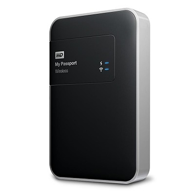
The WD My Cloud app makes connections to mobile devices useful and operates smoothly on both iOS and Android. However, Android devices offer more functionality, including DNG file support and an additional slide show feature for JPEG files. These features are invaluable for viewing photos, and I feel somewhat disadvantaged that they are not available on iOS. Thus, I hope this will be resolved soon.
Thankfully, my Pentax K5 II DSLR camera can be persuaded to save DNG and JPEG files simultaneously so that they can be viewed full screen on both types of devices without having to transfer them onto the tablet first as you would with Apple's SD card reader. Usefully, that gets around my oversight in buying iPads with only 32 GB of storage each. That now looks like a false economy given what I am trying now.
Such is the weight difference, just taking along my Apple iPad Pro and the WD device will save around 1 kg and there is less fuss at airport security screening too. While my HTC phone would suffice for seeing photos as slide shows, I am wondering if my battered Google Nexus 9 could come too. The only dilemma then would be how to pack things, since I am not sure how a large iPad screen would seem to cabin crew or other passengers during take off and landing. That makes using the Nexus 9 onboard more of a proposition, and the iPad might go into the hold luggage to make life a little easier. Still, that choice is a minor concern now that I can try travelling overseas without a laptop to see how I get along.
Pondering travel device consolidation using an Apple iPad Pro 12.9"
18th September 2016
It was a change of job in 2010 that got me interested in using devices with internet connectivity on the go. Until then, the attraction of smartphones had not been strong, but I got myself a Blackberry on a pay as you go contract, but the entry device was painfully slow, and the connectivity was 2G. It was a very sluggish start.
It was supplemented by an Asus Eee PC that I connected to the internet using broadband dongles and a Wi-Fi hub. This cumbersome arrangement did not work well on short journeys, and the variability of mobile network reception even meant that longer journeys were not all that successful either. Usage in hotels and guest houses though went better and that has meant that the miniature laptop came with me on many a journey.
In time, I moved away from broadband dongles to using smartphones as Wi-Fi hubs and that largely is how I work with laptops and tablets away from home unless there is hotel Wi-Fi available. Even trips overseas have seen me operate in much the same manner.
One feature is that we seem to carry quite a number of different gadgets with us at a time, which can cause inconvenience when going through airport security since they want to screen each device separately. When you are carrying a laptop, a tablet, a phone and a camera, it does take time to organise yourself, and you can meet impatient staff, as I found recently when returning from Oslo. Since checking in whatever you can as hold luggage helps to get around at least some of the nuisance, it also might be time for the use of better machinery to cut down on having to screen everything separately.
When you come away after an embarrassing episode, as I once did, the attractions of consolidating devices start to become plain. In fact, most probably could get with having just their phone. It is when you take activities like photography more seriously than the gadget count increases. After all, the main reason a laptop comes on trips beyond Britain and Ireland at all is to back up photos from my camera in case an SD card fails.
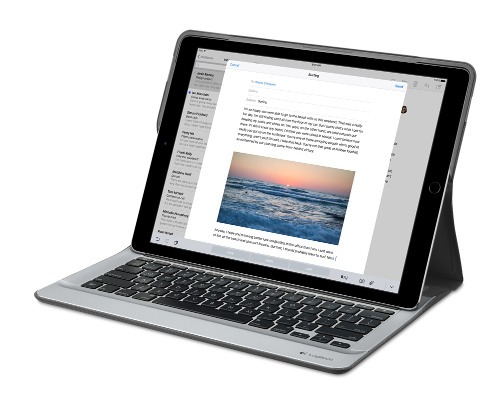
Parking that thought for a while, let's go back to March this year, when temptation overcame what should have been a period of personal restraint. The result was that a 32 GB 12.9" Apple iPad Pro came into my possession along with an Apple Pencil and a Logitech CREATE Backlit Keyboard Case. It should have done so, but the size of the screen did not strike me until I got it home from the Apple Store. That was one of the main attractions because maps can be shown with a greater field of view in a variety of apps, a big selling point for a hiker with a liking for maps, who wants more than what is on offer from Apple, Google or even Bing. The precision of the Pencil is another boon that makes surfing the website so much easier, and the solid connection between the case and the iPad means that keyboard usage is less fiddly than it would if it used Bluetooth. Having tried them with the BBC iPlayer app, I can confirm that the sound from the speakers is better than any other mobile device that I have used.
Already, it has come with me on trips around England and Scotland. These weekend trips saw me leave the Asus Eee PC stay at home when it normally might have come with me, and taking just a single device along with a camera or two had its uses too. While the screen is large for reading on a train, I find that it works just as well so long as you have enough space. Otherwise, combining use of a suite of apps with recourse to the web does much of the information seeking needed while on a trip away, which meant that I was not found wanting. Battery life is good too, which helps.
Those trips allowed for a little light hotel room blog post editing too and the iPad Pro did what was needed, though the ergonomics of reaching for the screen with the Pencil meant that my arm was held aloft more than was ideal. Another thing that raised questions in my mind is the appearance of word suggestions at the bottom of the screen as if this were a mobile phone, given that I wondered if these were more of a hindrance than a help given that I just fancied typing and not pointing at the screen to complete words. Though copying and pasting works too, I have found the screen-based version a little clunky. Thus, I must see if the keyboard one works just as well, though the keyboard set up is typical of a Mac and that affects word selection. You need to use the OPTION key in the keyboard shortcut that you use for this and not COMMAND or CONTROL as you might do on a PC.
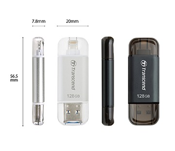
Even with these eccentricities, I was left wondering if it had any utility when it came to backing up photos from digital cameras, and there is an SD card adapter that makes this possible. A failure of foresight on my part meant that the 32 GB capacity now is an obvious limitation, but I think I might have hit on a possible solution that does not need to upload to an iCloud account. It involves clearing off the photos onto a 128 GB Transcend JetDrive Go 300 so they do not clog up the iPad Pro's storage. That the device has both Lightning and USB connectivity means that you can plug it into a laptop or desktop PC afterwards too. If that were to work as I would hope, then the laptop/tablet combination that I have been using for all overseas trips could be replaced to allow a weight reduction as well as cutting the hassle at airport security.
Trips to Ireland still may see my sticking with a tried and tested combination though because I often have needed to do some printing while over there. While I have been able to print a test document from an iPad Mini on my home network-connected printer, not every model supports this and that for NFC or Air Print is not universal either. If this were not an obstacle, apps like Pages, Numbers and Keynote could have their uses for business-related work and there are web-based offerings from Google, Microsoft and others too.
In conclusion, I have found that my iPad Pro does so much of what I need on a trip away that retiring the laptop/tablet combination for most of these is not as outrageous as it once would have seemed. In some ways, iOS has a way to go yet, before it could take over from macOS, yet it remains in development so it will be interesting to see what happens next. All the while, hybrid devices running Windows 10 are becoming more pervasive, so that might provide Apple with the encouragement that it needs.
Trying out Irish Mobile Broadband
2nd January 2012
Over the course of a year, I end up visiting Ireland a few times, so I decided to invest in a Meteor PAYG broadband stick to see how I'd get on with it. For €20, you can get a 30-day pass with 7.5 GB downloading capacity, a more generous offer than you'd get with some UK mobile networks (T-Mobile really comes to mind here). Signal strength was strong wherever I tried it too with 3G being available so long as you are in the right place with EDGE being the lowest that I got otherwise. Download speeds are good too so it turned out to be a good investment of €30 to get the Huawei E173 USB dongle (I had a T-Mobile one of these before that no longer works, so I am keeping an eye on reliability with this one; though the design seems a little different, I am getting OK so far) and €20 of credit that comes with it. After all, anything's better than the punitive roaming rates that UK providers charge.
Sometimes, things do get missed...
18th September 2009
Being a user of Textpattern, I should have a vested interested in any developments in that venerable web platform. However, the latest release came out at the end of August unbeknownst to me and that's with an entry on the Dev Blog. Since those blog entries come irregularly, that might have been how I missed it, especially when there were other things going on in my life like the installation of new windows in my house and weekends spent in Scotland and Ireland.
Still, the whole release was more low-key than, say, a new version of WordPress where many would be shouting how important the upgrade would be and with messages turning up on blog administration screens too. There may be good reason for this, given the recent problems experienced by those who fail to keep up with progress. Of course, WordPress is a major target for unwanted attention, so it's best to keep your wits about you. Though the quieter nature of the Textpattern project might be an asset when it comes to warding off miscreants, its greater compatibility with more technically minded folk may help security too. While saying all of that may be pure speculation, you only have to look at the world of operating systems to see how the idea came into my mind.
A later posting on the Textpattern blog tells you about the new goodies available in release 4.2.0, yet here's a short selection to whet your appetite: themes for the administration area, multiple sites and new tags. Upgrading proved painless, though I did try it out on an offline version of the microsite where I use Textpattern before making a move on its online counterpart. Even if all went smoothly, it's always best to look before you leap, or a site rebuild might be in order and no one needs that.