TOPIC: FONT HINTING
Improving Font Display in Fedora 15
When I first started to poke around Fedora 15 after upgrading my Fedora machine, the definition of the font display was far from being acceptable to me. Thankfully, it was something that I could resolve, and I am writing these words with the letters forming them being shown in a way that was acceptable to me. The main thing that I did to achieve this was to add a file named 99-autohinter-only.conf in the folder /etc/fonts/conf.d. The file contains the following:
<?xml version="1.0"?>

<!DOCTYPE fontconfig SYSTEM "fonts.dtd">

<fontconfig>

<match target="font">

<edit name="autohint" mode="assign">

<bool>true</bool>

</edit>

</match>

</fontconfig>
Enabling autohinting improves font appearance in Fedora 15. The TrueType bytecode interpreter (BCI) was recently added to FreeType after its patent expired, but this actually decreased font quality on my system. I applied Kevin Kofler's autohinting fix and installed GNOME Tweak Tool, which lets you adjust autohinting settings. This combination solved my problems, particularly with letters like "k". Now, I am considering trying the same solution in openSUSE, which also has unsatisfactory font rendering, though I'll have to wait for GNOME Tweak Tool until they release a GNOME 3 version.
Better font display in Firefox 3 on Ubuntu
Now that all bar one of the Firefox plugins that I use have been updated to work with it, I have finally jumped ship to 3 from 2.0.x. The move wasn't without its travails, though. For one thing, Google Toolbar stopped working, and I resorted to Googlebar Lite instead for my needs. Apart from that, the only other irritation has been the appearance of fonts in the new version.
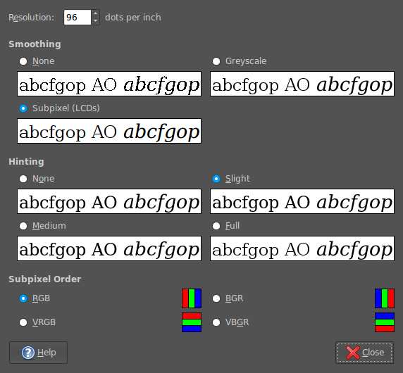
In Firefox 2, it would seem that I was getting away without tweaking my system settings to be their most optimum. With 3, I could do that no longer because of an irritating and pervasive fuzziness that particularly afflicted k's and w's. The way out of this turned out to involve changing my Appearance Preferences (Preferences > Appearance from the System menu). The required attention was focussed on the Fonts tab, whereupon the Details button was brought into use.
In the resulting dialogue box, smoothing was set to "Subpixel (LCDs)" and hinting to "Slight". Closing down everything after making the required selections and a restart of Firefox was all that was needed to improve matters and more completely make myself at home with Firefox 3.