TOPIC: CONTEXT MENU
Blocking unwanted interface elements in ChatGPT with uBlock Origin
This time last year, I was a regular user of Perplexity. Unfortunately, it began to live to its name when news items began to appear on its previously clean home page. When ChatGPT and Anthropic Claude gained the ability to search the web one after another, there was little need to use Perplexity any longer. Before that happened, I began to use uBlock Origin to block the offending panels that I found so intrusive.
However, I still retain an enduring intolerance of intrusions into clean interfaces on public GenAI tools. Thus, when ChatGPT started to offer inspiration for using it in a dropdown panel below the text box, I began to look for ways to block it. It is not as if I need ideas from others anyway; quite enough come up for me from my daily computing.
While disabling memory may help, I sought another way to turn the dropdown panel, only to find that there was none. That left uBlock Origin as my means of control. Unfortunately, OpenAI do not make it easy to block the offending insertion; Perplexity was very simple: right-click on the item and navigate to uBlock Origin > Block element... on the context menu that appears. Making the selection on the ChatGPT interface was unavailable because of how they structure things.
Ironically, I started to pursue the matter using the ChatGPT tool itself. All of this was on Firefox, so I could explore the code by right-clicking on the page and selecting Inspect from the context menu that appeared. Just viewing the source code was not an option either; obfuscation on the OpenAI end saw to that: they appear to use JavaScript to convert indecipherable symbols into code that a browser can render. There was some toing and froing before I got as far as a workable solution.
This needed me to get into the uBlock Origin Dashboard through selecting its icon on the toolbar (while I have it pinned there, you may need to click on the Extensions button in the same place as an additional step before all the steps that I describe here) and then clicking on the gears icon in the bottom right of the panel that appears. Once into the uBlock Origin interface, go to the My Filters tab and add the following code in there:
chatgpt.com##ul.divide-token-border-light.flex-col.divide-y > li.w-full
The first part (before the ## separator) is the URL, which may be chatgpt.openai.com for you. The rest selects the ideas panel while leaving the prompt text and hyperlink in place. That sufficed for me; a generic item is not as intrusive as anything built from your history or any other source of information. Naturally, the interface may change again, which might mean that I need to revisit the filter, but this works for now. We all learn as we go.
Using third-party tools to make an Evoluent mouse work as needed on macOS
Now having a new location from which I can work, I acquired an all-in-one desktop computer for use while there. While tempted by an HP option that runs Windows, I ended up choosing an iMac instead. That gained me extra disk space and more memory at a cost. Having UNIX-style command line capability was another attraction. After living with the Windows terminal for a while, its limitations were all too apparent to me.
While I started off desktop computing on a Macintosh Classic and having owned a MacBook Pro in the more recent past, there still was a learning curve. One of these related to the configuration of the mouse supplied with the system. Whatever about only having one button and needing to learn gestures, it was the speed at which the pointer goes that really got me reaching for my more usual Evoluent. Even so, the subsequent discovery of LinearMouse makes things much more bearable once all the requisite permissions were assigned.
Getting the Evoluent configured to my liking needed another third-party application: USB Overdrive. If Evoluent's own software fitted the bill, that would have done. However, they have done some finger pointing at Apple instead of updating it to work with the latest Mac technology. There may be truth in the accusations, but it is striking that another piece of software works when theirs does not. Nevertheless, the other option worked once it got the permissions to detect the hardware. Then, it was a matter of working out which button was which on the mouse, so I could have them assigned as I wished.
After that, I could settle into the new system and get used to its idiosyncrasies. Adding Parallels got me a Windows 11 virtual machine for business compatibility, while I got going with setting up some automation using the macOS terminal. All is becoming more settled than working out of a laptop.
Needing third-party software does have a catch, though: underlying changes to macOS could scupper things. It was the sort of thing that made me move away from GNOME Shell as my Linux desktop. The extensions on which I was depending kept getting obsoleted by every new release. It is something to watch, even if macOS evolves less dramatic than GNOME 3 in its various forms.
Restoring the menu bar on GNOME Terminal in a GNOME Shell session
By default, a GNOME Terminal instance does not display a menu bar and that applies not only in GNOME Shell but also on the Cinnamon Desktop environment. In the latter, it is easy enough to display the menu bar using the context menu produced by right-clicking in the window before going to Edit > Preferences and ticking the box for Show menubar by default in new terminals in the General section. After closing the Preferences dialogue, every new GNOME Terminal session will show the menu bar.
Unfortunately, it is not so easy in GNOME Shell, though the context menu route does allow you to unhide the menu bar on a temporary basis. That is because the requisite tick box is missing from the Preferences dialogue box displayed after navigating to Edit > Preferences in the menus. To address, you need to execute the following command in a terminal session:
gsettings set org.gnome.Terminal.Legacy.Settings headerbar false
This change permanently adds the menu bar and includes the previously missing tick box, which is selected when necessary. Although GNOME Shell has a minimalist design in some aspects, making this function difficult to access seems excessive.
Making pages of new documents look right in LibreOffice Writer on wide screens
My recent move from Linux Mint 17.3 to Linux Mint 18.1 brought with it version 5.3.0.3 of LibreOffice. What that brought was an oddity where the default blank document in a fresh LibreOffice Writer session had its only page displayed to the right within the application window. To me, this looks like a bug, even if I have a 24" computer screen.
After searching, I found a solution that displays a single page in the centre of the application window instead of offset to the right. First, go to the View menu and select Zoom. In the sub-menu, click on 'Zoom...' to open a dialogue box. This has two columns. Under View Layout, the Columns setting was highlighted with 2 columns selected. Choose Single Page instead and click OK to dismiss the dialogue. The Automatic option also works. I cannot understand why such an odd default was selected.
Getting rid of Windows 10 notifications about disabling start-up applications
On several Windows 10 machines, I have been seeing messages appearing in its Action Centre pane with the heading Disable apps to help improve performance. It appeared again recently, so I decided to look further into the matter.
What I found was that the solution first involves opening up the Control Panel, which takes a little finding in Windows 10. You could use Cortana to get to it or right-clicking on the Start Menu and left-clicking on the Control Panel menu. Using the Windows key + X will produce the same menu, and choosing the same entry will have the same effect.
Once the Control Panel is open, it makes life a little easier if you change to the Large icons view using the drop-down menu under the Search Control Panel box on the right-hand side. Then, what you need to do is click on the Security and Maintenance icon.
Once in that Security and Maintenance section, you are presented with two subheadings, one for Security and one for Maintenance. So long as you have not dismissed the message in the action centre, you will see a corresponding entry under the Maintenance section. At the bottom of that entry, there will be a link that turns off these messages permanently, and clicking on this will have the desired effect.
A look at Windows 8.1
Last week, Microsoft released a preview of Windows 8.1 and some hailed the return of the Start button, yet the reality is not as simple as that. Being a Linux user, I am left wondering if ideas have been borrowed from GNOME Shell instead of putting back the Start Menu like it was in Windows 7. What we have got is a smoothing of the interface that is there for those who like to tweak settings and not available by default. GNOME Shell has been controversial too, so borrowing from it is not an uncontentious move, even if there are people like me who are at home with that kind of interface.
What you get now is more configuration options to go with the new Start button. While right-clicking on the latter does get you a menu, this is no Start Menu like we had before. Instead, we get a settings menu with a "Shut down" entry. That's better than before, which might be saying something about what was done in Windows 8, and it produces a sub-menu with options of shutting down or restarting your PC as well as putting it to sleep. Otherwise, it is a place for accessing system configuration items and not your more usual software, not a bad thing, but it's best to be clear about these things. Holding down the Windows key and pressing X will pop up the same menu if you prefer keyboard shortcuts, and I have a soft spot for them too.
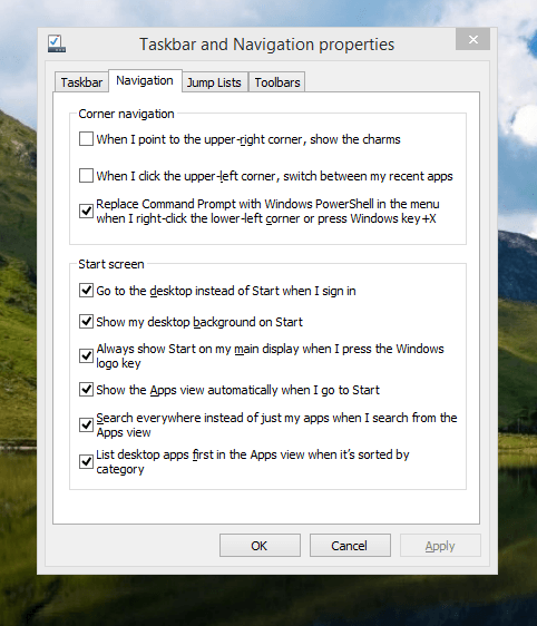
The real power is to be discovered when you right-click on the task bar and select Properties from the pop-up menu. Within the dialogue box that appears, there is the Navigation tab that contains a whole plethora of interesting options. Corner navigation can be scaled back to remove the options of switching between applications in the upper-left corner or getting what is called the Charms menu from the upper-right corner. Things get interesting in the Start Screen section. This where you tell Windows to boot to the desktop instead of the Start Screen and adjust what the Start button gives you. For instance, you can make it use your desktop background and display the Start Screen Apps View. Both of these make the new Start interface less intrusive and make the Apps View feel not unlike the way GNOME Shell overlays your screen when you hit the Activities button or hover over the upper-left corner of the desktop.
It all seems rather more like a series of little concessions, and not the restoration that some (many?) would prefer. Classic Shell still works for all those seeking an actual Start Menu and even replaces the restored Microsoft Start button too. So, if the new improvements aren't enough for you, you still can take matters into your own hands until you start to take advantage of what's new in 8.1.
Apart from the refusal to give us back a Windows 7 style desktop experience, we now have a touchscreen keyboard button added to the taskbar. So far, it always appears there even when I try turning it off. For me, that's a bug, so it's something that I'd like to see fixed before the final release.
All in all, Windows 8.1 feels more polished than Windows 8 was and will be a free update when the production version is released. My explorations have taken place within a separate VMware virtual machine because updating a Windows 8 installation to the 8.1 preview is forcing a complete re-installation on yourself later on. Though there are talks about Windows 9 now, I am left wondering if going for point releases like 8.2, 8.3, etc. might be a better strategy for Microsoft. It still looks as if Windows 8 could do with continual polishing before it gets more acceptable to users. 8.1 is a step forward, and more like it may be needed yet.